Most great sports properties have a specific appearance that allows fans to remain connected to it despite changes in players over decades. Traditions are important in sports franchises, especially those that bind teams with adoring fans over the years.
Logos play an essential role in sporting history as these symbols highlight traditions, team history, and even ownership. If you are looking to create fun and innovative logos for your sports team or enterprise or a blog, you can use sophisticated logo maker that are readily available on the web.
Here, we present the most iconic logos across sports teams that are some of the best examples of graphic designing. A few of these logos have been created by professional graphic designers while others have been drafted by amateurs.
- New York Yankees
Designer: Louis B. Tiffany
The New York Yankees logo is possibly the most recognized sporting design in the world. The interconnected “NY” has transcended baseball to become an icon for New York itself. This design was created for a medal for the New York Police Department (NYPD) for Officer John McDowell. He was the first NYPD officer to be shot in the line of duty. The logo initially appeared on the baseball uniform of a team known as the New York Highlanders in 1909 and subsequently became the Yankees logo in 1922.
- Hartford Whalers
Designer: Peter Good
This logo was created in 1979 for the Hartford Whalers, and the team used it up till 1992 when the design underwent an updating of the color scheme. The genius of the Whalers logo is the manner in which the “H” is created within the “W” which is shaped like a whale. The Hartford Whalers logo is one of the most recognizable designs in sporting history.
- Texas Longhorns
Designers: William Andrews

The Longhorn nickname first appeared in1903 when journalist D.A. Frank used it to describe the football team at the University of Texas. The logo was initially used on a blanket which was presented to the team in 1913. After that, the Longhorns symbol became immensely popular with images across the Memorial Stadium. This symbol is an excellent example of a logo created by an amateur as the designer, William “Rooster” Andrews was a sporting goods trader.
- Chicago Bulls
Designer: Dean Wessel
The Chicago Bulls logo is an immensely memorable design created by Dean Wessel in 1966. The initial design underwent one change at the behest of the team owner, Dick Cline, who requested that blood be added to the logo. This logo remains a famous symbol of the Chicago Bulls.
- Golden State Warriors
Designer: Unknown
The Golden State Warriors symbol is masterful in its simplicity. The logo was introduced in the year 1969. The Warriors became California’s team in 1972. This versatile symbol has been reworked for contemporary Warriors uniforms. This logo has been widely accepted as one of the most stylish symbols in basketball history.
- San Jose Sharks
Designer: Terry Smith
The designer for this logo, Terry Smith, played basketball at Stanford University. Smith has designed a host of sports logos. However, San Jose Sharks is his most famous creation. The San Jose Sharks logo is forceful and assertive, and it was extensively used till 2007. After that, it was given a low-key makeover.
- Quebec Nordiques
Designer: Unknown
Quebec’s hockey team migrated to Colorado in 1995 but still retained its logo which was in use since 1972. The logo comprises of an icon shaped like an igloo giving it an “n” shape coupled with a hockey stick. This symbol pays tribute to the team’s origins as the Western Hockey League’s (WHL) northernmost franchise.
- Dallas Cowboys
Designer: Jack Eskridge

Another exemplary logo by an amateur designer is the Dallas Cowboys symbol. Legendary Dallas Cowboys coach Tom Laundry hired Jack Eskridge who worked for the Cowboys till 1973. The original design for this logo included a white star which Eskridge made blue. In doing so, the designer gave the lone-star state a symbol that goes beyond football.
- St. Louis Blues
Designer: Unknown

This logo was introduced in 1967, and is based on W.C. Handy’s 1914 song called “St. Louis Blues”. The symbol depicts a blue musical note with wings that signify power and action. The logo has been revised a few times by the team. However, it still retains its authentic flavor.
- Portland Trailblazers
Designer: Frank Glickman
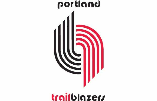
This innovative logo design depicts the game of basketball. The pinwheel shows two teams of five players competing aggressively against each other. The Portland Trailblazer’s logo is one of the most sophisticated and avant-garde designs in sporting logos.
Subscribe to our RSS-feed and follow us on Twitter to stay in touch.
Discover more from Life and Tech Shots Magazine
Subscribe to get the latest posts sent to your email.
This blog will come in handy for many people. Thank you for talking about such a unique and important topic. Hopefully many have benefited. Anyway, thank you for sharing this blog with us.. Appreciate from Fast-Clipping-Path team.
The most important thing for a logo is the font. So in my opinion the font should always be important. Anyway, Great blog.
Appreciate from<ahref=”https://freefontsvault.com//”>Free-Fonts-Vault .