We all have a tendency to impress someone with good stand out photograph. Taking quality pictures using high-end devices aren’t always representing what your brand wants to say. Viewers should understand what’s the photo is about. Here comes the term “improving images’ quality”. Editing can twist an image and can help you to get “Wow” feedback.
An editor wants to ensure the photo looks realistic and natural. But it’s a tough job, even for a veteran. When you are involved in post processing, be careful. Over-editing may ruin the presentation. It can turn the snaps into over/under focused object. And surely, it’ll misinterpret the impression.
Photoshop is being designed to turn a good photo into great! Use tool where it’s really necessary. The excess will make it worse.
Here are 10 common yet biggest mistakes, editors can easily avoid.
1. The less the good:
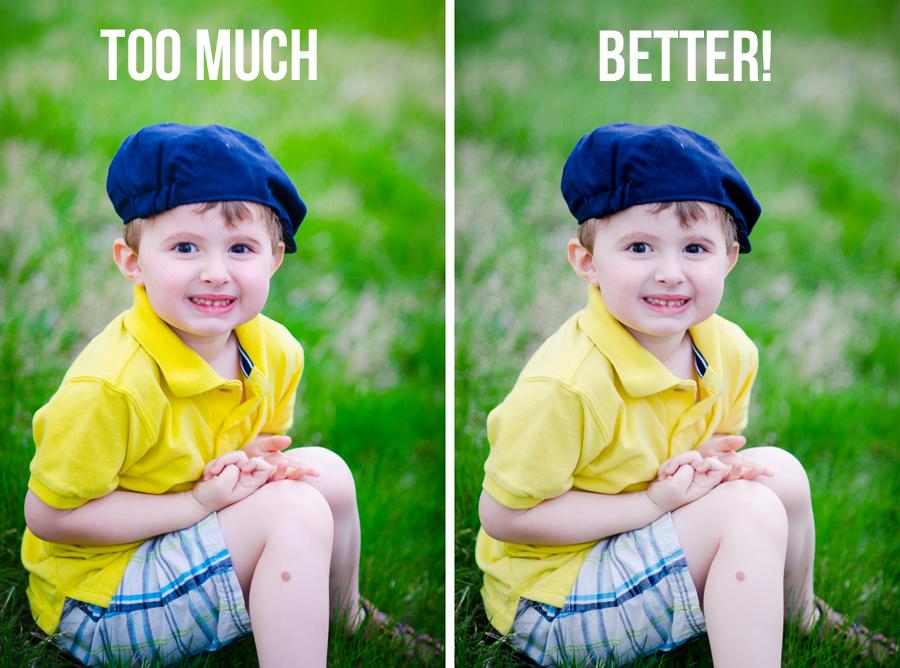
Manipulate to improve, not to destroy. Too much blurring, sharpening reduce photo’s natural tone and make it dull. That’s why the best practice is “less is more”. Don’t overdo your editing talent.
A good photo must have perfect color contrast and lightening balance. Keep things natural. Moreover, it’ll reduce your mental loads a lot.
2. Avoid over cropping:
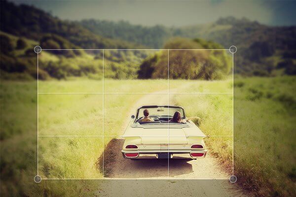
Cropping is necessary to remove the unwanted object. But at first, know what to keep. Your artistic view may not match with your client’s demand.
It may ruin the overall plan. So don’t go crazy. Take time and start after knowing what to display.
3. Concentrate on Skin Smoothing:

Who likes the plastic skin? Every skin has unique and balanced texture, color, shadows, and blemishes. Over-editing will turn a natural female face into a Barbie doll. How ridiculous the model will look, right.
If editors try to over show his/her talent in appearance, the skin may begin to look like plastic. While reducing noise pay attention and zoom again and again in between correcting the snaps. If it looks like waxworks; means you’ve gone too far.
4. Maintain proper Clarity:
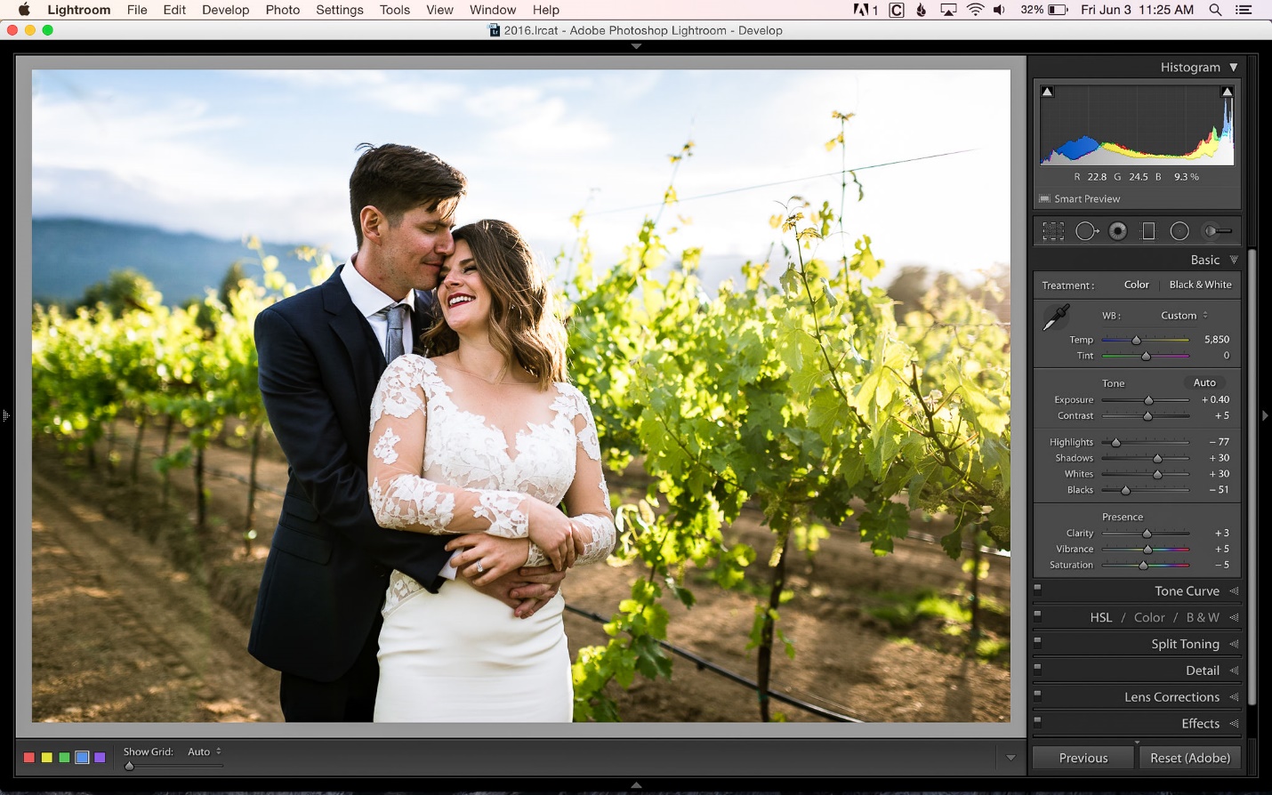
It’s one of the popular and important sliders for image editing service providers. Play fair with the contrast bar. Don’t push it hard or go fast. You don’t want to create artificial looks, do you? So move pointer slowly.
The tone curve will let you edit contrast from high to low. Use it wisely to avoid murky or crunchy look. Though from history panel you also can redo your restoration, know your tool well before making action.
5. Keep your image straight:
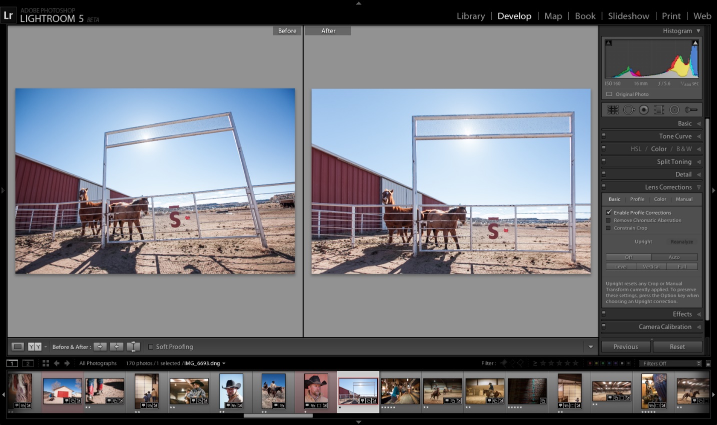
Keep the image straight not vertical or not horizontal until it’s really necessary. Again don’t overuse your artistic talent. In most cases, wrong angles represent ugly mistakes.
The Lightroom has a fantastic feature which let you straightening the image very easily. Just drag a line outside the cropped image.
The develop panel also has a Lens Correction option. It’ll help to fix vertical or horizontal angles. If you want positive regards from viewers, don’t distort the image and maintain guidelines.
6. Play fair with Color Temperature:
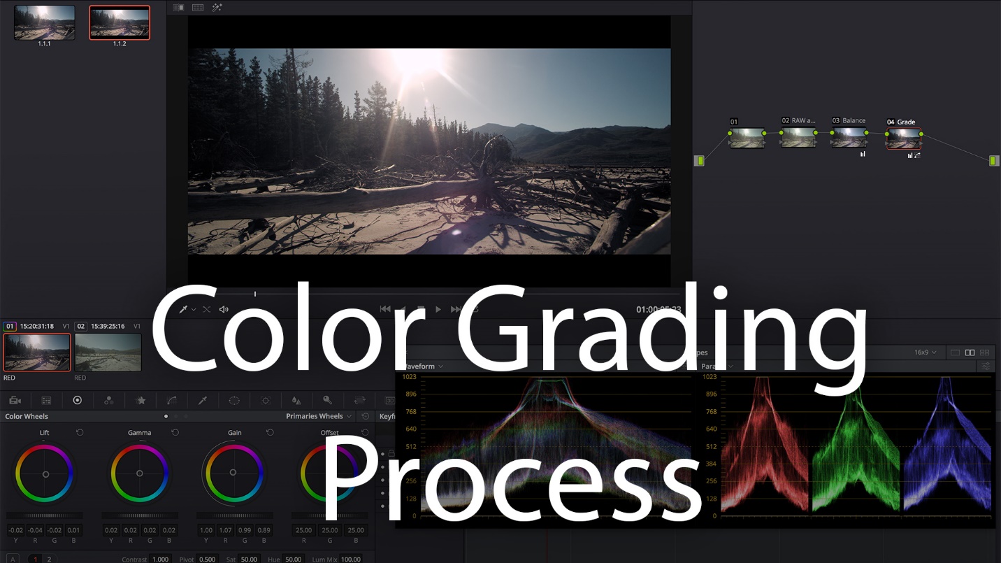
Maintaining balance in color temperature is also an important task for all image editors. Snap must not look too cold or warm. If you need to change white balancing, prefer raw file. Changing from JPEG is a tough job to do. You must maintain the hue of the particular light source of the image.
If the viewers’ attention is dragged into the weird color than the main focus, there is no point of doing post-processing work.
7. Poor Extraction often destroys the photograph:
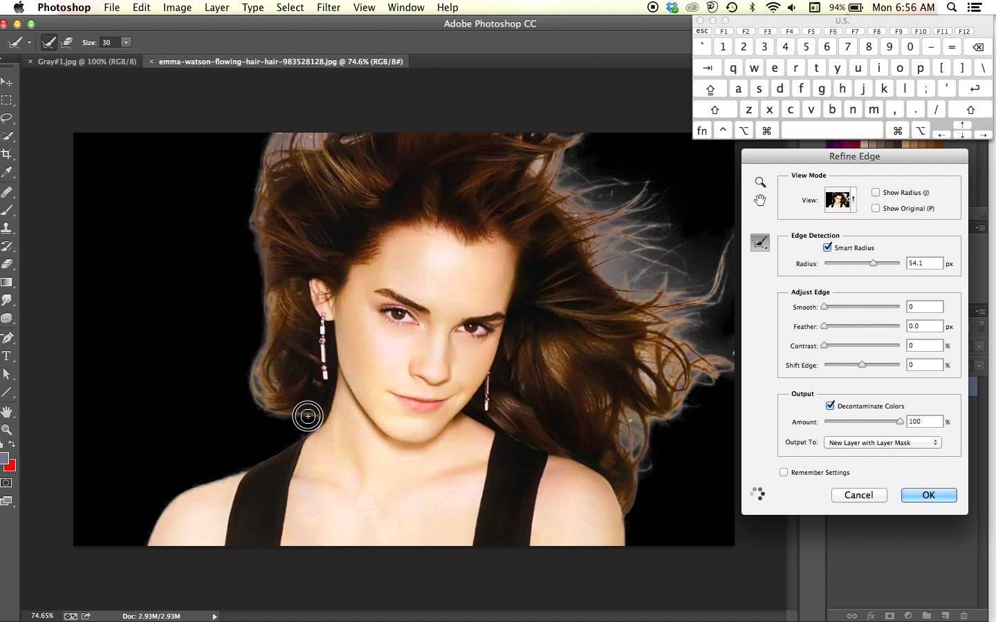
Extracting a subject from the background is a very tricky task. Even pro retouches and editors face challenges to prepare green screen. Be careful in cutting edges. Rough edge doesn’t represent professional look.
As a photographer, if you really want to avoid the hassle, pay attention while you create the photo. If the background or surrounding objects of the main photos are less, use wide apertures.
8. Handle textures with care:
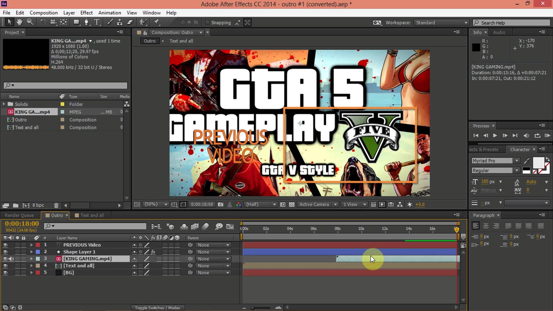
If you are really an expert in creating gaming effect, then you’ll know how to play with it. This task isn’t for seasonal Photoshop editor. The edit should enhance the image. Otherwise, less is more. Don’t use it for the sake of use.
9. When most of the details are lost:
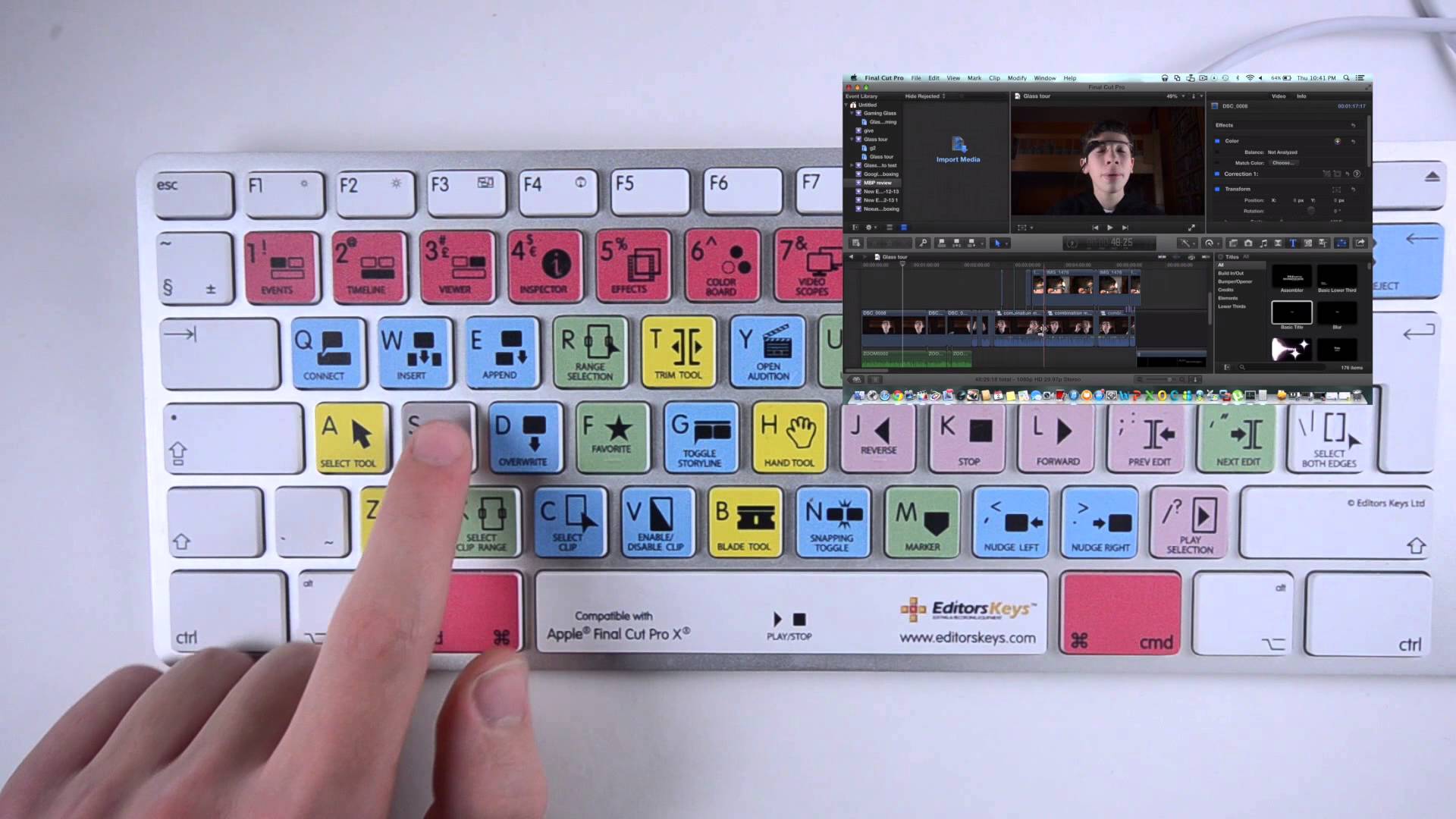
Maybe you have got the finest gear to shoot lots of details. But when you start playing with Lightroom sliders, a simple mistake can destroy all the details. It’s really sound weird!
Editing too much can cause serious damage to photograph, always. Adjust exposure, contrast, brightening until it looks natural. As long as all details are visible it’ll represent what you want to communicate.
A pro tip is to pay attention to the histogram. Stop and redo, if you mistakenly clipped the shadows and highlights. Hit the shortcut key “J” and it will go back to the original.
10. Know your editing tool:
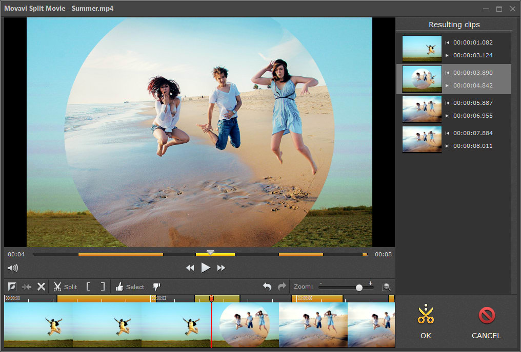
Starter and professional editors often jump on the new features quickly, even before knowing those well. But in reality, it’s tough to incorporate yourself where you hardly know all features. Explore the new addition and study well.
Editing requires lots of patience and practice. Most of the mistakes happen due to lack of knowledge about the tool or you don’t know how to fix the issue. Above all, check before and after edit and try to draw the line on how far you may go. The listed guidelines will help you to reduce these common errors.
Now It’s Your Turn:
It’s better to know beforehand what to put on your checklist to avoid the mistakes. But again to err is human. What would you do when you understand you have ruined your Photoshop work? Let us know your thoughts in the comments below.
Subscribe to our RSS-feed and follow us on Twitter to stay in touch.
Discover more from Life and Tech Shots Magazine
Subscribe to get the latest posts sent to your email.