The Beatles, Rolling Stones, U2, Pink Floyd and so on… There are many bands which are known for their unique logos, alongside great music. It clearly shows that music isn’t all about sounding great but looking great too. Getting a logo helps you spread the word for your music band among fans. After all, you want your fans to recognize your brand graphically too.
As a music band, you want your followers to understand your neo-soul, chillout, hip-hop, and rock punk vibes even before release, don’t you? That’s where a professional logo let your fans identify your band.
But what makes your logo stand out from the other bands? It’s the concept that brings each element of the logo on a single canvas and coveys to the listeners what they can expect from the band. Not to forget, the logo will be printed on the shirts, stickers, CDs and other materials as the face of your band.
Here, to help you take some inspiration, we bring you a list of 35 beautiful band logo designs.
1. Rolling Stones
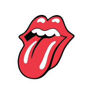
Infamously famous logo of the rock legends, Rolling Stones, is easily recognizable. The logo was an inspiration from Mick Jagger’s mouth. The Tongue and Lips logo was designed in 1971 by John Pasche. He is said to have been profoundly influenced by Mick Jagger.
The logo is evocative and enduring till date because the red lips summarize the rock ‘n’ roll legends perfectly.
2. Pink Floyd
When it comes to the live-performances with great sound and lighting, Pink Floyd’s name is unforgettable. The London-based polarizing psychedelic rock band’s logo is known for its unique theme. The artwork released for their album— Dark Side of the Moon became the symbol of the band. The 1973 artwork, created by Storm Thorgerson features a triangle (prism basically). The prims show an illustration of light passing through it. It rejoices the light aspects of the performances done by Pink Floyd. While Storm Thorgerson took the responsibility of design, George Hardie took charge of illustration.
3. Queen
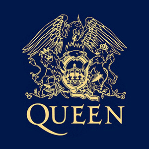
Not only Freddie Mercury’s incredible voice made Queen, a world-famous rock and roll band, but its logo too. The crest-style logo is not only symbolic but detailed too. You know what; it features the zodiac sign of its every original member. The logo was designed by Freddie Mercury himself before the release of the band’s debut album.
The two lions standing for Leo symbolize John Deacon and Roger Taylor both. The crab created atop the “Q” stands for the Cancer sign of Brian May. And, Freddie Mercury’s sign Virgo is depicted by two fairies.
Usually, people overlook its logo, but seldom do they know it’s inspirational. The artwork has a Royal Coat of Arms’ influence. Look at the crest, and you will find a gigantic phoenix dragon (not exactly Phoenix but looking like that) and crown.
4. The Beatles
As compared to any other rock and roll band, the Beatles had the most significant influence on the people. Even today, people get struck by Beatlemania. They still buy music and memorabilia signifying this legendary band.
However, their logo often gets overlooked. The “Drop-T” logo, unlike today’s flashy logos, is simple. It was created in 963 by Ivor Arbiter. There is an interesting story behind it. It’s said that Ringo Starr and Brian Epstein were looking for a new drum kit. They bagged a deal with Ivor Arbiter who was the owner of the Drum City. Starr and Epstein requested him to highlight the “beat” section on their band’s name while designing it across the drumhead. Arbiter created it on a paper for them to see. This is how the Beatles’ logo came into existence.
5. Metallica
This band’s logo is hard to forget. Rock fans recognize it with ease. The first and last letters transformed into lightning bolt not only symbolize rock and roll but also create a visual appeal. The edges have been sharpened to give an impression of broken shards. The rest of the typography is bold and thick resembling strength.
6. Run DMC
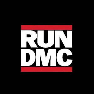
The logo of Run DMC is one of the most creative logos in the music industry. It continues to appear on the t-shirts of hip-hop lovers all around the world. What makes this logo timeless is the color scheme which is featured in three-part and solid typography.
Did you know Run DMD is the only logo to feature on Adidas sneakers? This clearly speaks of its timeless appeal.
7. AC/DC
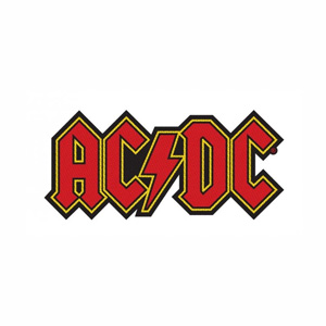
Their band’s logo has everything done in the right way. The pointed serif font gives it an edgy appearance while the thick lettering gives it a strong look. The top portion of every letter has a peaked appearance that resembles a triangle. In the center lies a lightning bolt that separates these two pairs of letters that relate to their genre and name.
8. Guns N’ Roses
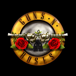
The use of two roses tied on a gun perfectly captures the name of this band. The logo appears in a circle with guns and roses illustrations placed in the center. The circle has a glittery and metallic effect that easily attracts the eyes.
9. Nirvana
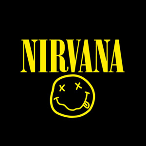
It is one of the most identifiable logos in the world of music. This logo has jazzed up people’s t-shirts for decades. A smiley face illustration with Onyx lettering with contrasting colors makes it iconic.
10. Gorillaz
By taking creativity a few notches higher, the band’s logo design truly stands out. They have chosen a graffiti-themed typeface to sum up the essence of their band. The typography used in the logo is a homage to street-art as well that captures political aesthetics too.
11. The Monkees
Although the band was created for TV, it still is known for its great tunes. Nick LoBianco drew the amazing logo in the shape of a guitar to relate it to music. The logo is still in use.
12. The Doors
Inspired by geometric design, this simple but iconic logo is unique. The tiny italicized “THE” positioned in one corner of the letter “D” is a unique logotype famous all around. All in all, the logo shows the 60’s hippie, trippy, counterculture. The unique typographic design of the “Doors” is still fresh.
13. The Dead Kennedys
Resembling an anarchy sign, the logo created by Winston Smith is an ideal example of simple design. The use of red, white and black colors add to its bold, symbolic appearance. The abbreviated name with a graffiti-sit design stands out.
14. Weezer
Designed in 1993 by Patrick Wilsen (the drummer of the band), initially, the logo appeared in the lower case. Denoted by a “flying W”, the logo went under a few changes. As far as the font is concerned, it uses Futura Medium.
15. Sunn O)))
Created by Stephen O’Malley, the rock band Sunn’s logo is a visual treat to the eyes just like their music to the ears. Bold typography is what adds to its simple but strong appearance.
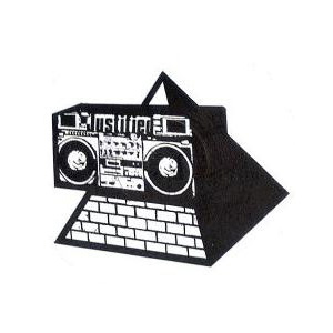
16. The KLF
KLF had a keen interest in iconography. You can see its impact in their videos, record covers, performances and their logos. Their logo in pyramid blaster style is undoubtedly a masterpiece. It was, however, set for the vinyl.
17. Public Image Ltd
Dennis Morris is known for creating this timeless logo in 1979. Not only this, but he also designed the iconic Metal Box covering of Public Image Ltd. It is still considered one of the best album cover designs of all time.
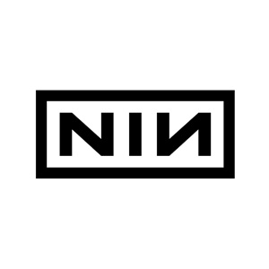
18. Nine Inch Nails
When it comes to simplicity at its best, Nine Inch Nails’ logo is worth mentioning. It depicts letters arranged under a thick border. The logo made its appearance in 1989 on the debut album of the band. It is believed to be influenced by the typography of Tibor Kalman featured on Talking Heads album.
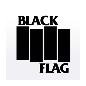
19. Black Flag
Raymond Pettibon, who created the name of the band, also designed its logo. The design features four black bars. Solid yet bold typography matches the name and essence of the band perfectly.
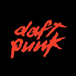
20. Daft Punk
Same as their name, this band’s logo ends up looking like aggressive. Guy-Manuel de Homem-Christo, one of the band’s members, created this logo, which is undoubtedly quirky. The use of bold colors and textures make the logo even fast-moving same as their tunes.
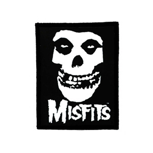
21. Misfits
The skull logo of the band made its first appearance on the Horror Business Single. The image became so popular that the band adopted it as their mascot. Even after so many years, the logo hasn’t lost its charm.
22. Outkast
The logo evokes the hilarious side of the band. It features graffiti-style typeface harmonized with the illustrations of crest and crown.
23. Devin Townsend Project
Minimalism isn’t a term popularized these days. But it’s been around since a long time back. And, this logo is a perfect example of that. The typography-based design has the three initials that refer to the band’s name depicted in two pounces. A creation of Travis Smith, the logo signifies the term less is more.
24. Justice
Choosing a highly used illustration or a universal symbol isn’t a good idea. But the French electronic duo— Justice just did it. And, it did pretty well for them. There is a reason why they chose this symbol. According to Gaspard Auge, one of the band members, the music venue is nothing less than a church. Music lovers gather at one place and focus on one thing. And, this symbol goes well with their interest. The logo has appeared on almost every album cover of the band.
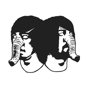
25. Death from Above 1979
Do you take delight in eye-popping graphic designs? This logo is said to have graced covers, banners, posters and stage shows. The noise rock duo with the elephant-like trunk-inspired design is not only creative but easily recognizable.
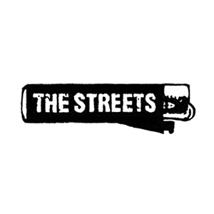
26. The Streets
The original logo design of the British group— The Streets isn’t iconic but unique in its own way. There is a lighter image that features the name of the band in gritty typography. Though their logo has undergone a few changes, this original version is remarkable.
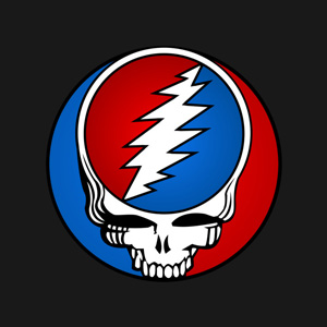
27. Grateful Dead
The “Steal Your Face” illustration is the most recognizable image related with the band— Grateful Dead. With a bright color scheme, skull and the common rock ‘n’ roll lightning bolt, the logo stands out. The circle used in here denotes listeners. It’s uncommon that people relate with a skull, but this logo is known to draw the fans of Grateful Dead for years.
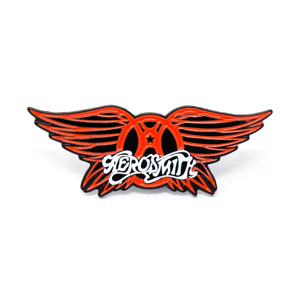
28. Aerosmith
Well, Aerosmith is known for having several logos representing their band. But this one is famous. When you see the logo, you will find the use of psychedelic writing for the name of the band. The letter “A” has a circle around it that resembles both A for Aerosmith and A for Anarchy. Wings are also there as one of the logo elements representing freedom.
29. Deep Purple
It’s simple but iconic. The smart use of the letters D and P makes it distinctively visible. The two letters have been used cohesively with a purple color scheme to reflect the name of the band.
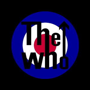
30. The Who
This band boasts of having a globally recognized logo. The most common element of this logo is the bull’s eye. The British flag inspires its color scheme. “The Who” is depicted in black color. The letters ‘h’ of both words are connected. This connection within the circle gives a sense of belonging and inclusiveness while the arrow, going up of the letter “o” from “who” stands for movement.
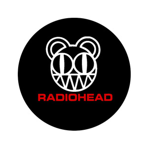
31. Radiohead
This band is known for not having any official logo for long. However, Stanley Donwood and Thom Yorke designed a modified-bear logo for them. It was designed for the band’s fourth studio album Kid A.
Ironically or intently, the name of the band signifies the arrival of modern art though with no meaning, complexity or use.
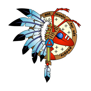
32. Adam and the Ants
Created by Danny Kleinman, the logo of Adam and the Ants is also called the Warrior Ant. The corker style gives this logo a tribal flair.
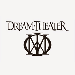
33. Dream Theatre
Created by Charlie Dominici, the former vocalist, the band’s logo has a “majestic symbol.” The logo seems to be influenced by Mary, Queen of Scot’s mark. Dream Theatre kept this logo and featured it for their every album release.
34. Jurassic 5
Perfectly combining ‘J’ and ‘5’ to depict their band’s name, this hip-hop logo is a visual treat. The circular design makes it easy to be featured on many album covers and merchandises. The logo was created by Charlie “Chali 2na” Stewart, one of the band members. The logo has managed to position itself as one of the best band logo designs.
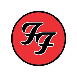
35. Foo fighters
It is yet another example of a band logo famous among fans. It comprises interlocking ‘Fs’ designed in a circle motif. The name of the brand has been kept a little rounded with the compact typeface. In rock music domain, it is one of the most recognizable and famous logos.
Conclusion
Like many brands out there, music bands have started using a logo to tell their fans what they offer. Each of these bands rose to popularity with their grooving music and performances. However, they didn’t mind representing their band with a logo.
Subscribe to our RSS-feed and follow us on Twitter to stay in touch.
Discover more from Life and Tech Shots Magazine
Subscribe to get the latest posts sent to your email.
