For the past few years, the spotlight has noticeably shifted from impressing search engines to attracting the people browsing behind the computer screen. Because of the latter need, attention on the user’s experience has grown considerably.
And aside from a user experience-friendly web design, what else comes to your mind when user’s experience is the focus of the conversation?
Why, that other factor is content, of course!
Experts within the digital marketing industry have realized that it’s impossible for web design to be useful if content is dreadful. Likewise, great content sinks into anonymity with poor site design.
So, should these two, UX and content marketing, collaborate?
Yes, they should. Because there are ways UX and content marketing can work together.
How UX and Content Marketing Can Work Together
Superior user experience partnered with terrific content is a gamechanger. It leaves an impression on your target audiences.
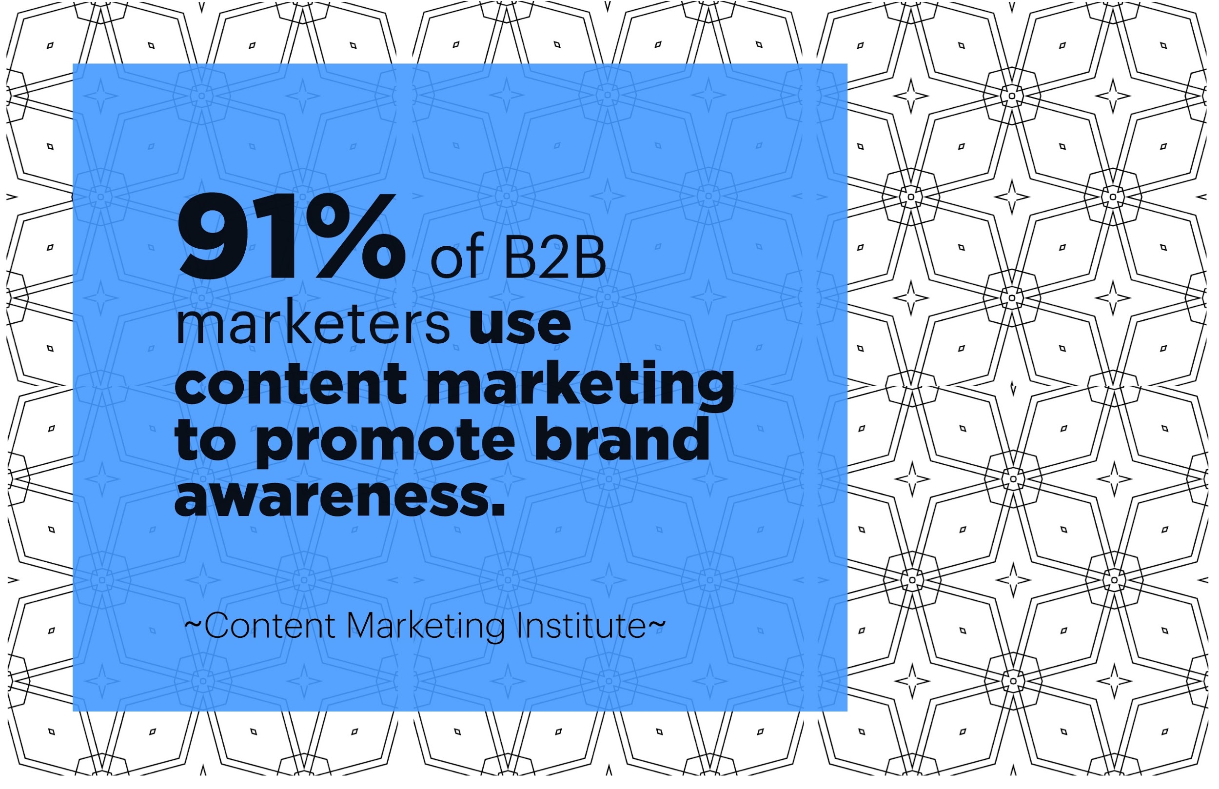
In the words of Content Marketing Institute’s Melissa Eggleston, “Making informed choices facilitates a smooth experience with content — which is why great UX design is usually invisible — invisible, but critical all the same.”
Knowing your target audience

Think of it this way. Suppose you’ve been informed that you need a buy birthday present for your team manager. But your knowledge about him is limited to the fact that he’s thirty years old, and he loves to read.
Would you get him a non-fiction book? Or maybe he’s in to fantasy? But perhaps reading glasses would do just in case he’s having eye problems because he loves to read way too much.
Your internal debate makes one thing startlingly clear, however. You don’t know what to get for his birthday, because you really don’t know him.
Creating buyer personas and gathering information about your audience is common practice in the marketing world by now. And everybody knows the importance of such a method. But while it’s very much applied in creating product descriptions, or writing web copies, it’s not considered thoroughly in the practice of web design and doing user experience.
If you don’t know your users — or at least have a general knowledge about their preferences — how do you expect to create a marvelous user experience for them? How do you know if the experience you’re building would appeal to them in the first place?
I don’t need to tell you to craft target audience profiles, or do your research via every Analytical tool you have (Google Analytics, social media analytics, etc). That’s practically basic knowledge. I would, however, like to remind people to determine user intent via Google’s search bar. Knowing searchers’ intent may open up insights you’ve probably never considered before.
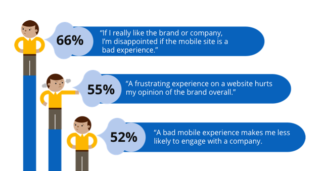
Horrible UX is the death of great content and vice versa
Let’s have another situation.
Say you were asked to review a website that’s just launched. And you had the following observations:
- You had trouble finding the menu
- The site took ten seconds or more to fully load the page
- You clicked on things that aren’t clickable
- You ran into trouble while navigating the website
Keep in mind that anything that leaves an impression on your target audience’s memory can become a brand value.
A horrible web design and slow loading speed can easily be equated with your brand name, and nobody who wants to get a profit out of their business would want that. Likewise, atrocious content can easily put anyone off, regardless of a seamless experience.
How do you design for a better user experience?

I won’t go into extreme detail or the point-by-point technicality of designing a user-friendly website. (That would be another article). But you can do it with some of these practices:
- Use heat maps: Heat maps are anywhere there’s data to depict. They are primarily used for representing complex statistical data. It’s basically a visual interpretation of analytics. You can use it to determine which areas in your website get the most clicks and attention.
- Looking at what users use: There is a difference between what someone wants and what they actually use. Don’t ask for users’ opinion. Watch what they do, instead. Heat maps can come in handy here.
- Give users a guided tour: This is especially crucial when you’re letting users use the website for the first time. Overlays, pop-up tips, and arrows pointing to the right direction or to what a button does is integral to your users feeling comfortable with how a site functions and how they would navigate it.
- Present value before proposing a commitment: Let’s put it this way. Do YOU want to be immediately bombarded with a ‘create an account’ page right after you click on a website. It’s like developers and business owners saying, “You want our service? You gotta pay and login with us first.” You’re not giving your users a choice, and they don’t like that.
- Give users a search bar: 50% of users use the search function as their main point of navigation. There are some people who won’t care about the drop downs and the side navigation. All they care about is searching for what they want, and you need to cater to that preference.
What are the best practices of writing good content?

The same thing goes for creating content that will interest your users, and keep them coming back for more. Some of the best practices you can employ include:
- Creating strong headlines: Great headlines spark interest and invites the reader’s attention. 80% of people will read your headlines, but only 20% of them will read the rest of the content.
- Answer the users’ questions or needs: Remember that the purpose of you creating content is to answer your users’ needs. Your users are on search engines because they need something, and it’s the search engine’s job to deliver. It’s the same thing when people read blog posts and product descriptions.
- Do thorough research: When you cater to people and provide answers to their questions, it’s not a work of fiction. For this reason, your research must be thorough and properly cited. This is so you establish authority, and demonstrate your knowledge on the subject.
- Make your content interactive: How do you do this? You can engage with your audience by means of adding visual content in the midst of a long stream of words.
- Be fresh, and original as much as possible: Original content goes a long way with both search engines and visitors. Avoid copying other people’s work, and avoid respinning the same content over and over again.
UX attracts. Content is what makes them stay
The importance of site’s appearance and how comfortable it makes you feel while using it is a determining factor in attracting audiences and persuading them to keep using it. However, engaging content is what brings back a user. Even if you perceive your users as superficial people, they still won’t stick around for long if you have nothing useful to offer.
Design your website like you’re writing content. And write content like you’re designing a website
Look at design in the context of content creation. You’ll find that the entire process is much more wholesome. Consider the four basics required from content strategy before designing for UX officially begins, according to UX Planet’s Daniela McVicker:
- Content priority on the website
- Sitemap (or website hierarchy)
- Identification of needed pages/templates
- Content model (if you are designing for a content management system)
Think of your design as a tool used to communicate the valuable content for all your users.
Limit choices and minimize distractions

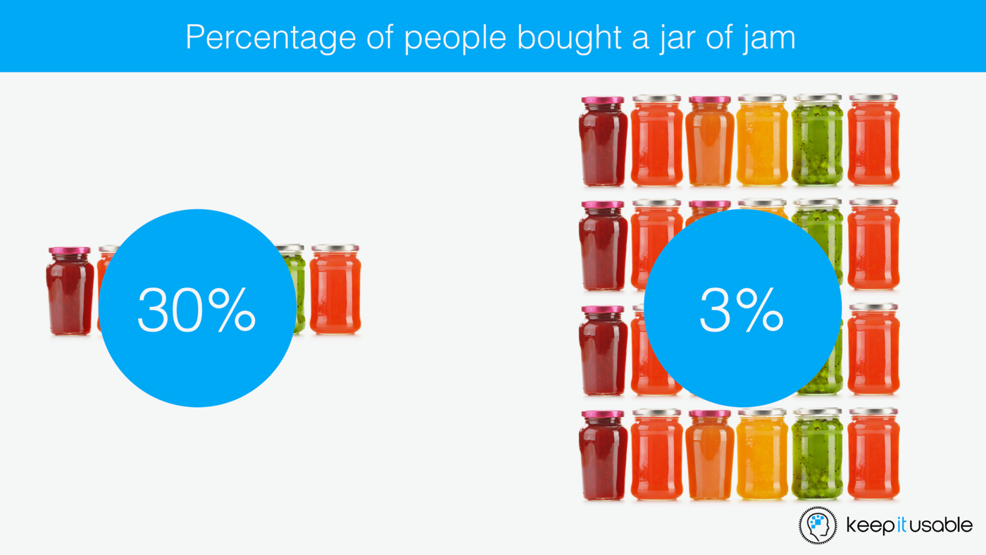
Something that’s well-established among UX designers is to limit the number of choices to minimize the distraction. Are you more likely to purchase a jar of peanut butter from 50 selections or can you pick much easier when there’s only two?
Not to say that many choices are bad. It’s just that, when you have more options, your attention is more divided and can even distract you from proceeding to the next step. (This is why multiple choices in exams succeed in confusing students, more often than not).
In designing UX and writing content, it’s useful to limit choices in some situations so the users and readers can focus on the elements that you would want them to prioritize. Among content marketers, this method of UX design can be applied through:
- Focusing attention on a narrowed topic, so you can focus on more important details.
- Limit the number of content snippets present in a single page.
- Make your starting points clear.
Humanize the experience
Think back to all the memories that you treasure, so much. You think about the emotions flying through you when that moment happened, right?
Emotions together with rational decisions govern our lives everyday. In the world of both UX, and content, how you make a person feel matters. It applies to the kind of web design you’re making, and in the content that you give away.
For content, injecting emotions and humanizing words is much simpler. You can humanize content through:
- Storytelling
- Emotional words to make your audience feel powerful and special
- Content that creates a feeling of belongingness
- Compelling copies that provoke the reader to learn more
- Promises that help achieve a goal
- A sense of humor
- Elements that surprise your readers
- Pop culture references
Establishing an emotional connection with the user via web design is doable too. In fact, microinteractions that happen in a website are much more noticeable than some of the other bigger changes. As users, we don’t focus on these microinteractions, but we feel them.
It’s like seeing a button on a web page come to life when you hover your cursor over it. It can be anything from confirming an item added to a cart in an e-commerce site, to a pull-to-refresh to update content (like in Snapchat).
Some of the best practices for microinteractions, according to Nick Babich include:
- Creating a habit loop
- Coming up with a theme to unify all interactions
- Making use of animations
- Injecting some humor into web design
The Takeaway
Like SEO and PPC, UX and content marketing have their own set of pros and cons, but they work better together. In fact, I’d say you can’t have one without the other.
Think about it. User experience aims to let users have the time of their lives browsing through a website. Content marketing wants to ensure providing high-quality content to a target audience.
Don’t they have the same goal; to provide a rich experience for those who will use a particular website?
If you haven’t thought about making UX and content marketing work together yet, perhaps it’s time we ought to rethink our overall strategies.
Bio:
Al Gomez is a digital marketing consultant. He is the President of Dlinkers, and he specializes in SEO, PPC, & web development since 2008. Al has over 10 years’ client digital marketing experience and has helped businesses such as Dr. Berg, Patexia, Panel Wall Art, the Ritz Carlton, and countless others use the web to drive online visibility and generate leads. He has even started, developed, and managed an e-commerce website — Unlideals.com and an SEO website, Alseoperth.com.
Twitter: @alseoblog
Discover more from Life and Tech Shots Magazine
Subscribe to get the latest posts sent to your email.