Design and aesthetic appeal probably isn’t the first thing that comes to mind when searching for the best web hosting providers. Instead, you might consider important factors like server uptime, site backup, tech support, features, and price. But let’s face it, looks are everything.
Having a clean and stylish look is the hallmark of any top-notch website, right? Quality websites today include nice layouts with visual design choices that make user navigation easy, like screens, buttons and visual components that are utilized by a website to help a user interact.
Check out American Airlines old website from 2014:
![]()
Hideous, no? It looks like a cluttered, hard-to-navigate government form created 10 years ago. This unappealing interface doesn’t help the already harrowing experience it can be to plan a flight, and users may subconsciously avoid buying tickets.
What Good Design Looks Like
So what is good design? A solid website can be eye-catching not due to its looks, but for other factors like a practical page layout, logical navigation, relevant content, and clear messaging. First impressions are everything in today’s world, after all. Here are a few of the most important components of great design:
- Minimalism — Many companies today are taking web design back to the basics with a minimalist approach in layouts and designs. Websites are featuring simpler designs with more blank space and fewer pages.
- User-Friendly — Usability is one of the most important aspects of a successful website. Websites that make use of intuitive design and aspects pleasing to the eye will attract more visitors.
- Personalized User Experience — A more personalized user experience has become the norm in web design. Rather than users having the same experience when visiting a website, a more personalized experience allows content to be delivered specifically for a particular user. This means adapting to a user’s needs and interests without the user having to do much.
- Superior Content — Less clutter is the way to go, remember? This means placing more focus on high quality content. Websites should provide users with useful information in multiple formats to keep them engaged but not overwhelmed, such as video or images in lieu of text.
- Bold Colors — Websites with more vibrant colors have become increasingly popular and play a big role in a website’s overall aesthetics.
- Card Design — More and more websites are using card-based design, which are those little rectangles packed with images and text that look like cards on a webpage. This design is ideal for users with varying screen sizes, like mobile devices or iPads because they can be easily adjusted to each screen.
This aesthetic also goes with the simple and minimalistic theme websites today are trying to achieve. The user is provided with a short burst of information in the form of a card that can be easily digested. They also provide easy call to actions (CTA), like buttons or links.
10 Web Hosting Providers with the Best Looking Websites
So out of the top of your mind, which companies do you think should have the best looking representative websites? Website development agencies, web design service providers and of course, – web hosting providers!
Now that we understand key website trends and what makes design successful, here is a list of web hosting providers that adhere to the modern rules of design with their excellent websites:
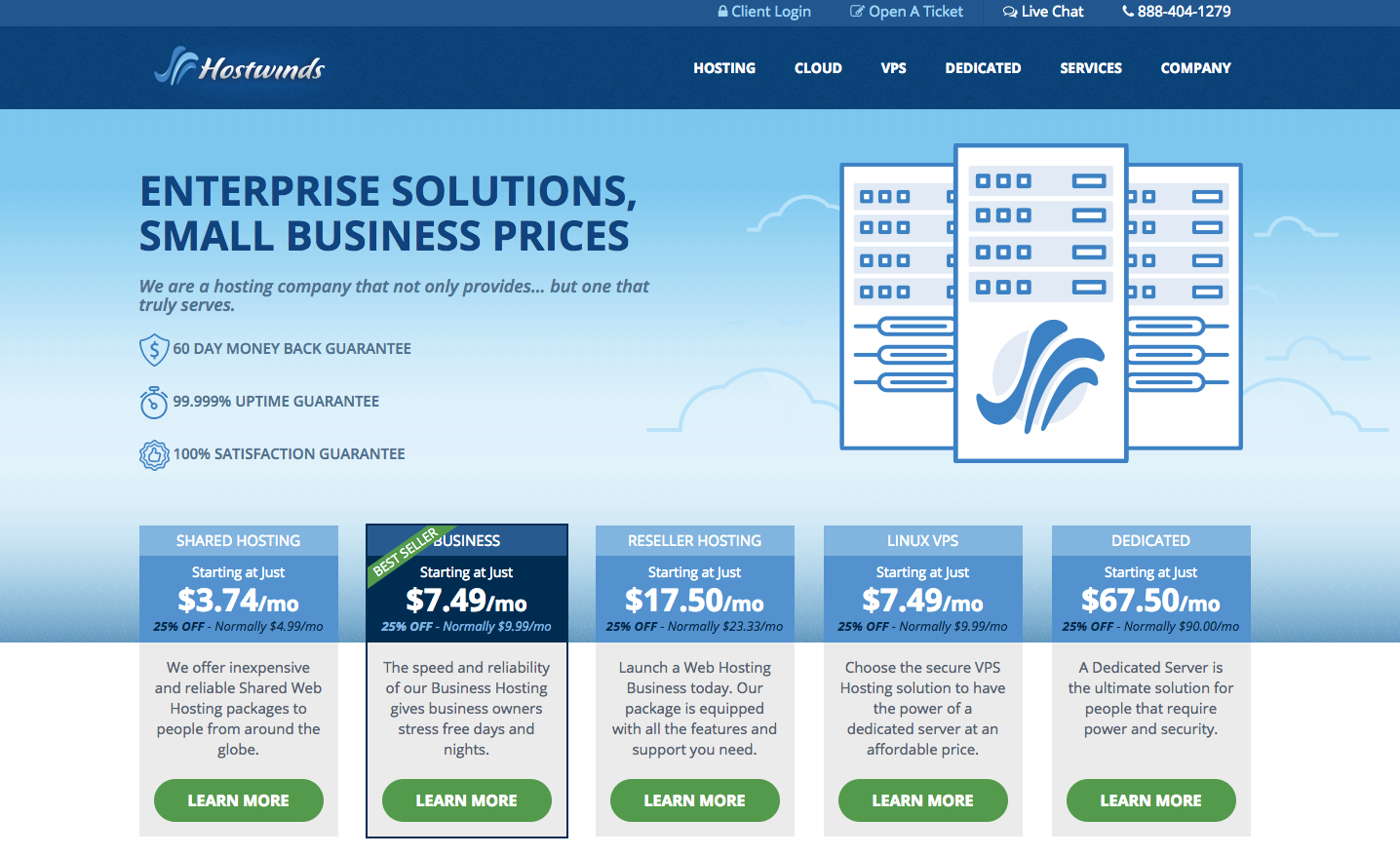
- Hostwinds — While they’re not a big-name hosting provider, Hostwinds’ website embraces simplicity and the minimalist approach by focusing on large areas of white space with large margins that tend to hone in on pieces of content. This along with their consistent blue and white colors makes for easy readability and user navigation.

- Flywheel — It’s no surprise that Flywheel has made the list, as they are a popular hosting platform for designers!
Flywheel hits you with a great impression as soon as you visit their landing page with their use of vibrant colors and images that immediately capture visitors. They also make use of a more minimalist approach, with plenty of white space and less content than other hosting providers.
![]()
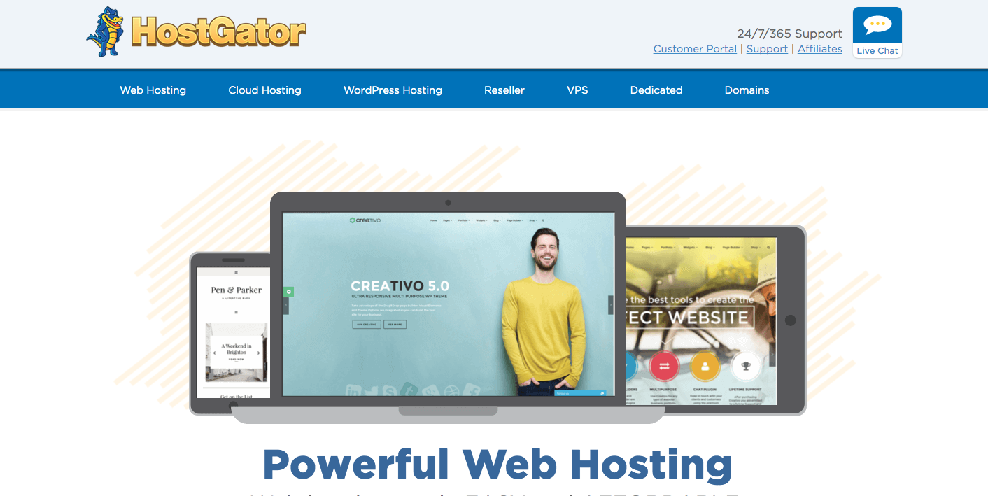
- HostGator — HostGator has come a long way in their website’s design evolution. With a bold logo and navigation bar, users can easily find their way to web hosting solutions.
HostGator also utilizes an interactive slideshow of images to market their web hosting efforts. With a big call-to-action button “Get Started Now!” clearly visible in vibrant orange, visitors to their website can be on their way without having to look around the site much.
When scrolling through their page, this prompts a very nice slide-in of soft-colored dynamic images standing behind small bursts of information in the form of cards, giving it a very clean look.
- Liquid Web — Before even having to scroll down their page, Liquid Web does a great job of delivering small tidbits of selling points to visitors right from the get-go. Without having to dig around, they clearly display one of their biggest pitches of being the fastest managed VPS in the market.

Liquid Web’s landing page is a lot longer than other hosting websites, but contains all relevant and important content that doesn’t feel cluttered.
![]()
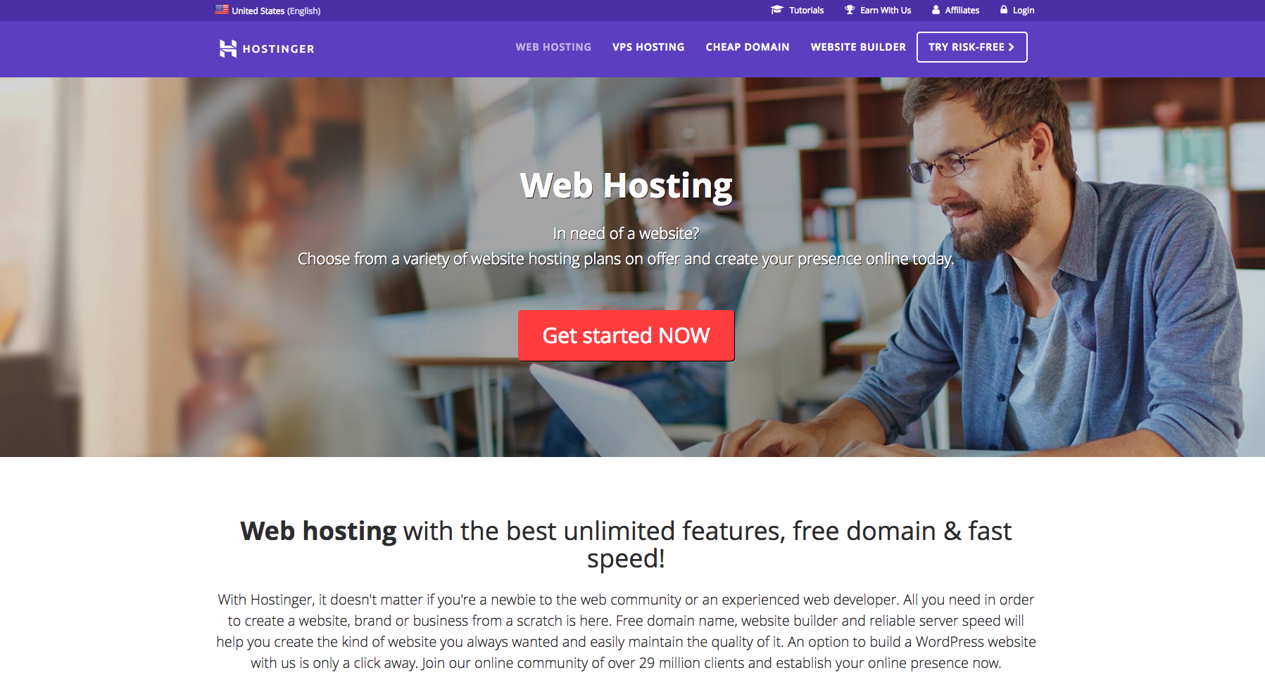
- Hostinger — Hostinger’s website takes an unconventional approach to web design by laying out a super simple web page with no videos or distracting graphics, instead focusing on high quality content. The first thing you’ll notice when visiting their page is a vibrant background color and big words advertising cheap web hosting with the price and a CTA button. Very basic but to-the-point, no frills.

- Namecheap — Namecheap does an excellent job of utilizing the screen’s real estate with an eye-catching illustration, a domain name search bar, their starting price, and a navigation bar displaying their top sellers.
Another great feature is their sub-navigation for specific users: Individuals, Business, Resellers. This helps guide potential customers to information that’s relevant to them and their needs.
![]()
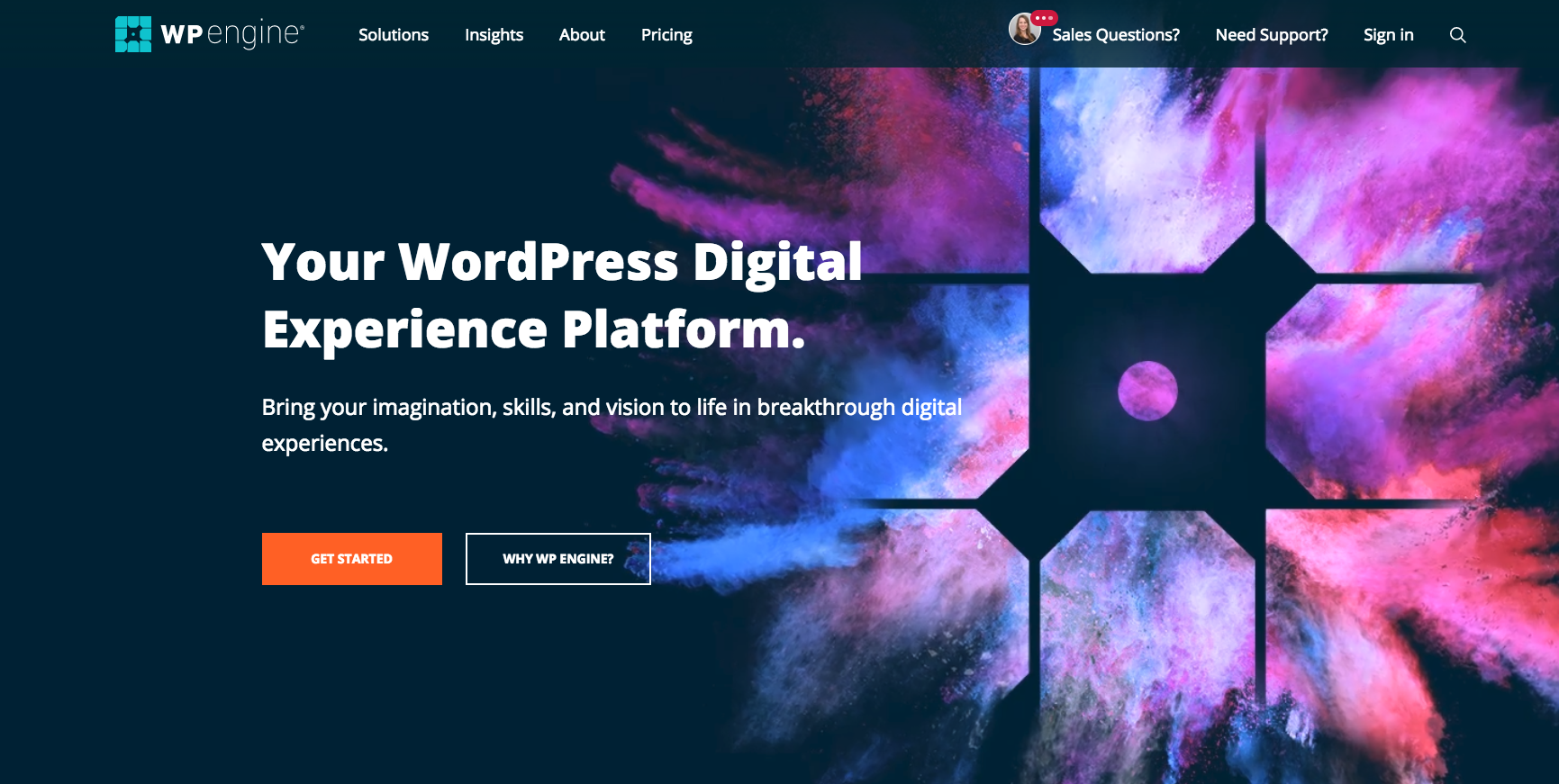
- WP Engine — Since they’ve been around for so long and are the most widely used CMS in the world, WordPress does an amazing job with their WP Engine hosting services website. While the colors and images are nothing special, it has very simple and easy usability. The website carefully lays out their products and makes it easy to get started with their step-by-step CTA.

- 1&1 — 1&1’s website embraces bold colors, making use of strong but calming blue tones throughout their page. This also helps the readability of the page’s content. The contrast between the blue, white and bright yellow also help locate the website’s desired goal of users clicking the hosting plan buttons.
Each plan they offer is clearly laid out on the first page and is easy to read and understand, which can go a long way for users who don’t feel like navigating around the website. All of the most important pieces of information are right there.
![]()
- DreamHost — While it’s a pretty generic Bootstrap/WordPress theme looking site, DreamHost is ultimately successful in its use of minimalism. The use of colors helps highlight the small pieces of text on the page, and the search bar clearly stands out, enticing users to enter a domain name.

- Bluehost — With a clean and simple design, Bluehost succeeds in displaying the most important information to their users: prices, freebies offered like domains and site builders, and a large CTA button that allows users to get started.
The page also highlights some of their best features, like easy WordPress integration and 24/7 customer support making Bluehost a nicely designed website.
![]()
Discover more from Life and Tech Shots Magazine
Subscribe to get the latest posts sent to your email.