A Logo design of a company is the visual representation of the goods and services that it offers or deals in. An impressive and excellent logo design is one which can be easily remembered and comfortably comprehended. It is marked by simplicity in creation and a self-explanatory message delivered along with it. However, one way of using simple designs in order to achieve creative excellence in logo designing is to include symmetry as the key element.
These symmetry design logos can be flipped and turned one side over and reused, as on both sides it houses a replica image of the other, like a mirror. It consists of perfect identical sides, is unique in itself and supports the brand name for which it has been formulated and created. Here are some top examples for Logo’s showing symmetry design, which can greatly inspire and assist you with a new logo concept for your company or organization.
Be inspired with these wonderful Logo Symmetry Designs and create a perfect logo for your company. Create them using Bluetail Logo Designer for an effective branding!
Top 10 Logo Symmetry Designs
1. Xhosa
Designed by Patriciape for a non-life insurance agency, the logo sign makes the letter X, which is the initial of the company’s name. Still an unused proposal, this simple yet reliable design feature is seeking critiques actively. The design was showcased on the presentation desk by the company. The use of a dark background with fresh colors on top makes the logo quite unique, interesting and stylish as well. The bold backdrop symbolizes and stands for the company’s firmness and reliance, which would definitely work in its favor.
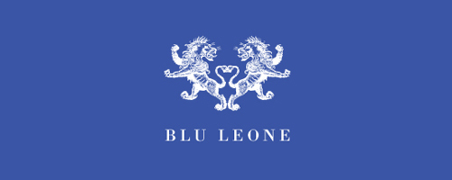
2. Blu Leone
The Blu Leone Logo design by Raja is an ident for a clothing business, still in its inception stage. The design of the logo reflects a strong identity, with a cool color combination which seems quite appealing and appropriate for a clothing brand. Thumbs Up to this symmetrical blue with white logo design.
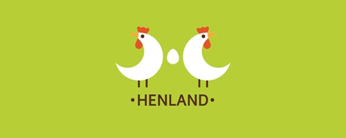
3. Henland
This bright and attractive logo designs seem self-explanatory, showing images of two hens and an egg in between. Designed for none other than a poultry company, designer Ru-Ferret uses a simple design element and effective color combination, to portray the motive of the copany and what it deals in.
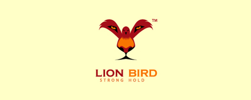
4. Lion Bird
Designer Nashifan uses a cool concept with smart execution skills, by creating an energetic logo to display the strength of a business. Signifying it as the lion of their field and at the zenith of success as a bird, this symmetry logo is sure to work in proximity and favor of the success of the company for which it has been designed.
5. Medical Cannabis Delivery Inc
Desugned by Shylesh, the loge represents four cannabis leaves placed in symmetry to form a medical plus sign. Each leaf can be contemplated and understood as arrows coming from four opposite directions to form the plus sign, which means that the company deals in delivering cannabis leaves solely for medical purposes.
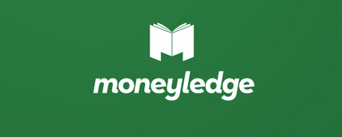
6. Moneyledge
Designer Roko Kerovec uniquely combines the initials and the motto of the company to display its features and what it stands for. Created and formulated for a web entrepreneur, the logo is set against a green bold background, with usage of the color white on top, to signify the company’s and its owner’s knowledge and understanding of money and its dealings, along with a promise of assurance to its customers for proper utilization of the same in the best of their client’s interest.
7. Music Production Company
This Logo design, by S. B. Design, was created for a music recording company. The design signifies a modern take on royalty, depicting simplicity and reliability, by using the initials of the company’s name in the best of its interest. The usage of a strong background in bold color promises a reliability of service offered by the music organization.
8. Resonance
Designer H.S. Hujao designed a very well-balanced logo, using a nice color scheme, which tends to create a dramatic effect, visually. By making use of fractal leaves, the designer formulates a calm and easily recognizable design concept, with a superb combination of cool colors which has been smartly and confidently executed. However, the design is actively seeking critical acclaim.
9. Teknex
The teknex logo does not include any domain name as yet. However, the logo has been created, keeping in mind the technology industry. It can be applied to any organization coming under the computer and networking industry. The unique ‘X’ has been created out of many dots, thereby reinforcing the X-factor in the word TEKNEX.
10. Trifecta
This logo design, by Genius logo, has been conceptualized for the company Trifecta, by making a stylized usage of the letter ‘T’. The designer has made an excellent choice of typography, imparting a very cool look to the entire design, thereby making it look very elegant and classy, at the same time.
About the author: Claudia is a blogger by profession. She loves writing on luxury and technology.
Subscribe to our RSS-feed and follow us on Twitter to stay in touch.
Discover more from Life and Tech Shots Magazine
Subscribe to get the latest posts sent to your email.

