A company’s product is known through its logo. It is the company’s public signature, and an indicator of the company’s success based on how often it is spotted in public.
One major principle in business is to never sit on one’s laurels and be complacent with its current success. Brands keep reinventing themselves to stay fresh, current and relevant. One way to do that is to re-introduce a new look on what is already familiar to the masses. Redesigning a logo sends the message that the brand is competitive and improving, while retaining quick recognition so that the previous generation familiar with a brand’s products do not have to strain their eye so much in recognizing it. The following are examples of logo revisions by some well-known brands.
1. Apple

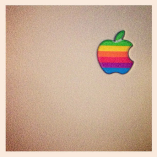
From the 1976 image of Isaac Newton under an apple tree, to the 1980’s rainbow-stripe apple image, to its current sleek, metallic chrome apple, the company has always represented itself as a leader in innovation. As their product line evolved, so did their logo. The recent line of Apple products exhibited the trademark streamlined chrome sheen, which therefore makes sense that the logo be designed to remind consumers of how they are going to see every Apple product released in recent years.
2. MTV
http://en.wikipedia.org/wiki/MTV
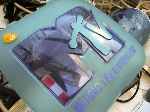
After its status as a premiere music video channel declined over the years, MTV (which used to mean ‘music television’) had to adopt a new format to compete with other networks over ratings and viewership. Their switch from music videos to reality TV shows required them to adjust their logo so that it will become compatible with their new format. The designers removed the ‘music television’ tagline and emphasized the letters ‘MTV’ as a more generic brand that broadcasts shows oriented for young adults.
3. Toys R Us
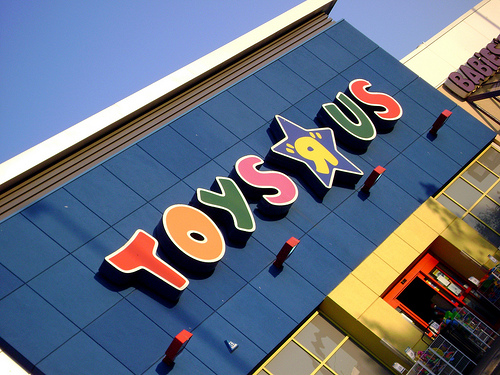
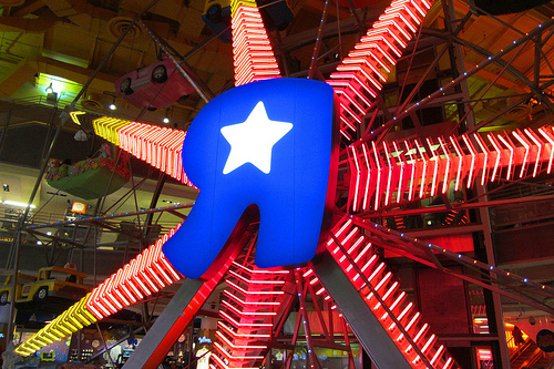
The update to the toy distribution giant’s reversed R logo emphasized on keeping the classic feel and yet making the trademark store name look cheerful and positive, which explains the superimposed star on the reversed middle R released in 1999. After 2007, a color change to the trademark R from yellow to blue was introduced to remind consumers of how Toys R Us made children everywhere feel happy and bright whenever they visit the store.
4. Starbucks
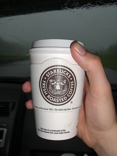
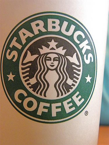
The present look of this coffee shop leader’s logo is much more clean-looking and quite easy to recall. The original logo was a woodcut-style illustration of a siren, a well-known creature from Greek legend. The logo upgrade was done in 1992, when the designers excluded the siren’s navel and breasts, and only left subtle suggestions of the fishtail. Before this was the second version, used from 1987 – 1992, where the siren’s breasts were covered by her flowing hair even if the navel was left intact. The fish tail was also made a bit shorter. The earliest version was based on a 16th-century Norse woodcut depiction of the mythical creature, where the siren was topless and had a fully visible double fishtail. The logo has been characteristically transformed over the years, and yet retains the original feel of the woodcut art. There was a time when the company’s designers removed the surrounding letters and only left the green themed siren art, in an attempt for brand recognition along the lines of products like Coke (the dynamic ribbon) and Pepsi (streamlined red-and-blue ball with white stripe), but it was not as effective and confused some longtime customers of the coffee shop franchise, who were used to seeing the letters surrounding the siren art. Starbucks restored the name text and combined it with the streamlined design, and it has been since an assurance to coffee drinkers and travelers the world over that for as long as they see the trademark name in the distance, it means that freshly-brewed coffee is available alongside their other refreshments.
5. Animal Planet
The popular cable television channel’s previous logo had a silhouette of an elephant and a spinning planet Earth that suggests what the programming was all about in a straightforward manner. This programming style was very popular among young people and inspired interest in nature and wildlife-themed topics. As Animal Planet’s audiences grew, and as some of its early demographic market got older, the channel’s executives saw the need to expand their content and included edgier, adventure-style entertainment, or as it would be put in modern programming parlance, ‘edutainment’, to both include information and entertainment. The current logo, a plain stylized text with the ‘M’ on its side, was an effort to suggest that Animal Planet is more than just an educational TV channel for young people. Some design critics consider the logo change as counter to the original intent of the programming, and others even said that it confuses viewers as to the content of the programs.
Every time a successful brand decides to do logo modification, the effectivity and results are variable, because the success of a logo revamp often depends on the response of the target market and the current social context of the consumers. There is also the risk of alienating previously loyal consumers when brands attempt to align themselves with new trends and a new demographic, so it’s a balancing act of taking in the new without throwing out the old. After all, it’s not just a logo with eye-catching artwork in it; it is and will always be representative of a company’s presence and influence in the consumer market, which is why it pays to revise a logo in just the right way as to send the intended message to its target market.
Guest author Laura Brentley is an iconophile whose mind is always blown by brilliantly designed logos and clever advertising in general. She also works as a senior sales manager at Card Printing US, a printer of rush and custom gift cards online.
Subscribe to our RSS-feed and follow us on Twitter to stay in touch.
Discover more from Life and Tech Shots Magazine
Subscribe to get the latest posts sent to your email.


2 Comments