How to Use Progress Indicators for Optimising User Experience?
How Progress Bars Can Boost User Experience and How to Design Them?
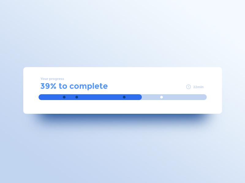
In the user experience design speed and performance stand out to be two crucial elements. This is precisely why new approaches like Accelerated Mobile Pages (AMP) and Instant Articles have evolved to help to deliver contents as soon as possible. While these are good for optimising app UX design or web UX, some web pages and functions that still cannot entirely do away with some loading time, at least need to make users informed and engage them visually while loading takes place.
A user should not be left in darkness during those small durations of a few seconds when a page or feature loads. This is where the role of progress indicators or the progress bars proves to be so important for making users feel at ease. For a website or mobile app UX design now progress bars play a critical role if those few seconds of glitches cannot be avoided entirely.
Progress Indicator for Loading Time Exceeding One Second
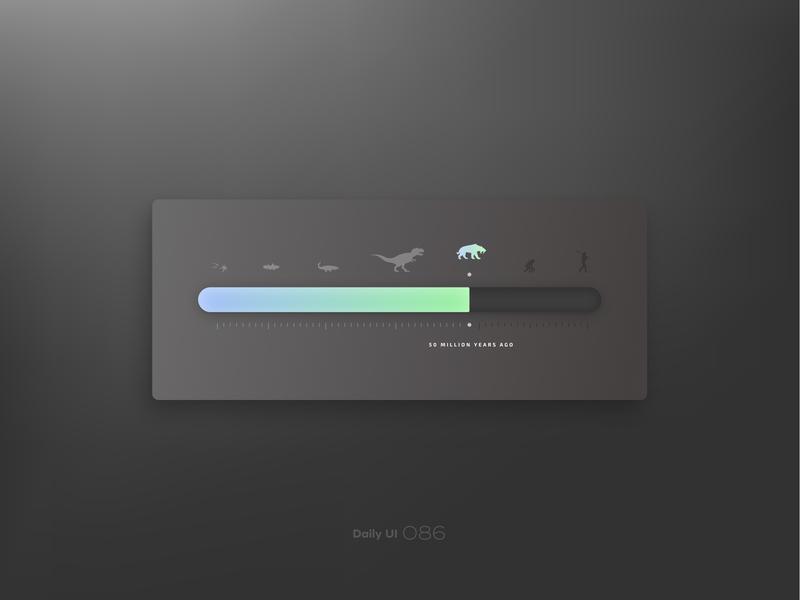
As users are increasingly becoming restless and impatient, even one second of delay in loading time can make them leave. This is why any action that takes more than one second of loading time should use a progress indicator. After the first second, the attention of the user begins to wander or shift to something else and ultimately makes an impression that your app or website is slow.
Instead of making users have such a negative impression about the loading speed of your website or app, by using a progress indicator you can mitigate this feeling and the entire waiting time. By using an indicator you can easily prolong the attention of the user on a website or app or the intended task.
Different Types of Progress Indicators
Source – http://babich.biz/content/images/2016/04/0-AmVWS1MBIG3BPeAy.gif
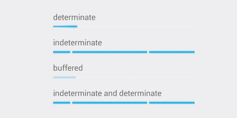
There are several different types of progress indicators out there. Most websites or app developers stick to mainly a few types of progress indicators as mentioned below.
- Determinate
Determinate Progress Bars or Indicators show the actual state of the progress of data loading process. This type of indicators makes an actual representation of the data loading in progress.
- Indeterminate
Indeterminate Indicators continuously loops or cycles irrespective of the loading state or the progress of the data loading process. The indicator that constantly loops or cycles only stops altogether as and when the loading is finished.
- Looped Animation
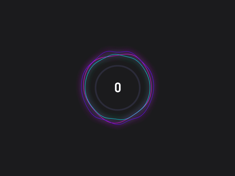
Looped animations are widely used for indeterminate indicators and being common types of indicators they often appear in various use scenarios and contexts. Often such indicators serving too many operating system functions or app functions actually generate annoyance. For instance, the loading indicator used by Apple iOS is widely used in a variety of contexts and use scenarios. Such loading indicators are detested by the users as users remain clueless about the loading time wherever they are used.
- Percent-Done Indicator
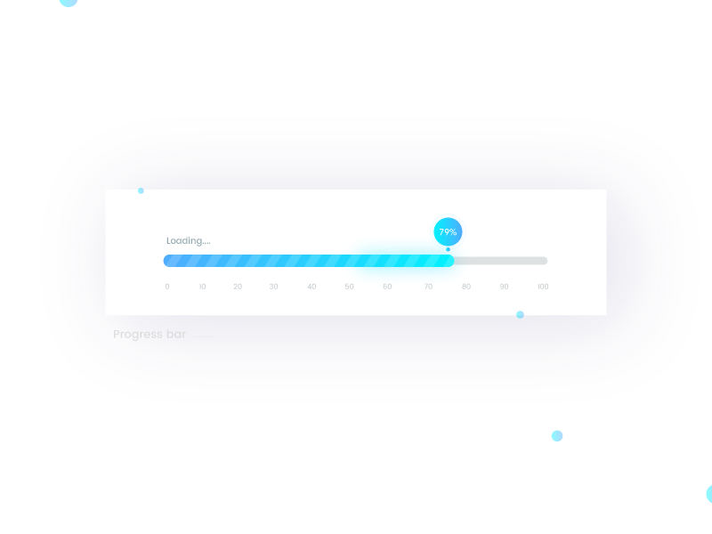
Another type of indicator is the one that shows the real numerical value of the loading percentage. Such percentage-showing progress indicators can be both linear and circular. Such percentage-showing indicators are right for any processes taking more than 10 seconds. Until 10 seconds simple determinate indicators may contain the patience of the users. But beyond 10 seconds, when users grow impatient they require exact information about the progress of the task.
- Morphed State
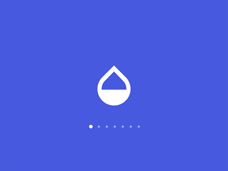
When an element of the user interface gets morphed into another element that indicates starting of another course of action, the UX designers use some animation to contain that morphing time and ensures delivering a smooth as well as engaging experience. Morphed State Indicators are used for the smaller duration of time and are crucial for maintaining a smooth transition from one UI element to the other.
Key Tips to Design Progress Indicators
To make the waiting time pleasant and waiting, you have to give extra attention to the design of the progress indicators as per the user context and scenario. Here we are going to explain some effective tips for designing good progress indicators.
- Explain with Additional Text
It has been seen that where users are informed by they need to wait they show more patient behavior. With the progress indicator, it is good to use additional text to explain the reason for waiting. Instead of trying to be specific, it is advisable to use a general statement like “this may take another five minutes”.
- Inform Users About the Work Done
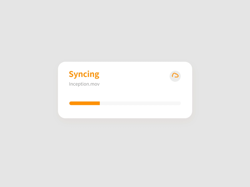
When the operations and tasks are time-consuming, it is advisable to inform users how much progress has already been made. You can inform users about the exact work done in numerical value. This helps users to make a clear estimation of the time required for the process to complete.
- Keep the Progress Indicator interesting
Never forget the fact that waiting is always wearisome and boring and none of us like to wait. This is why it is important to design the progress bar interestingly. Use playful animations and try to incorporate some interesting and funny actions that users enjoy while they wait for the process to complete.
- Make Sure Progress Bar Doesn’t Freeze Suddenly
The progress indicator is provided to help set an expectation for the users regarding the time required for the process to complete. This clearly gives users more impetus to wait patiently. But what happens when the progress indicator simply stops responding and makes no movement? Well, that’s when users think something must have gone wrong and that’s when they feel to leave the site altogether. This is why always make sure Progress bar never freezes or stops to move.
- Create A Feeling of Faster Progress

Human beings are more motivated by perceptions than raw reality. A progress bar creating an impression of fast loading speed works great in spite of the fact that the actual speed is not that impressive. A sense of faster completion time helps the users to stick to your app.
- Create A Visual Distraction
The actual trick is to reduce the perception of time through something visually distracting and engaging. If users can pay attention to something interesting while waiting, the wait itself looks negligible.
- Option to Pause or Cancel the Action
We all like to be in control of anything we do. So, besides urging users to wait with an interesting indicator you should also allow users to pause or cancel the action altogether. In case pausing and cancelling can lead to any loss of data already filled, inform users about this.
- Don’t Report Inaccurate Progress
Last but not the least piece of advice will be to stay clear of misreporting progress. By misleading users about the progress of the action you can only give them more reasons to leave the site.
Mastering the Science of Using Progress Bar
Now that you have known about how various progress indicators work and some useful tips about using them effectively, we need to spare a few words on the science and techniques of using the progress bars. Let us conclude our present discussion with guidelines for using progress bar in different user contexts.
Here are the different duration of the delay and respective options to use progress bars.
- 0-2 Seconds of waiting time: Generally, no progress bar needed.
- 2-5 Seconds of waiting time: A little animation like a spinner or some small action.
- 5-10 Seconds of Delay: Determinant Progress Indicator is required to show the progress from start to finish.
- 10+ Seconds of Delay: Apart from the progress bar, options of pausing and cancelling are needed.
- Time Units vs. Work Units
Progress bars can show progress either through time units or work units. The first option is great when you have a near-perfect idea of how long the process may take to complete. But when the time required for completing an action cannot be determined, showing the progress through work units will be more appropriate. While the first works well when the action involves too less data volume as the time for a few bytes of data may not linger for more than a few seconds. The second option works better when the action involves a larger volume of data impacting the duration indefinitely.
- Putting Together Everything Neatly
Now, it doesn’t take a lot of effort to put everything together for creating the right progress indicator that fits the action you want to use it for. For example, you can use a spinning ball or any other busy animation in case the process takes less than 5 seconds. In case of longer waiting time, you should use a progress indicator besides giving a rough estimate of the time to complete the process.
Conclusion
Progress indicators or the progress bars are considered as key components of user experience for modern websites and mobile apps. In any case, if your app or website cannot completely do away with the loading time glitches, it is advisable to give utmost attention to use progress bars effectively to help users feel at ease while the action takes a few seconds to complete.
Bio: Atman Rathod is the Co-founder at CMARIX TechnoLabs Pvt. Ltd., a leading web and mobile app development company with 13+ years of experience. He loves to write about technology, startups, entrepreneurship and business. His creative abilities, academic track record and leadership skills made him one of the key industry influencers as well.
Subscribe to our RSS-feed and follow us on Twitter to stay in touch.
Discover more from Life and Tech Shots Magazine
Subscribe to get the latest posts sent to your email.