An e-Store is developed for making sales. The end goal for all the online stores is the same. However, they may need a design with a different approach. Websites of two different businesses may not perform the same.
It happens that most of the online stores follow the design, layout, pattern, and features of the web shops that may not be in the same niche, industry, or scope.
As a result, they fail soon after launching their websites. To save them from the hassle of taking last minute preventive measures, I have composed a list of features and design tweaks that can help them uplift the design before offering sale.
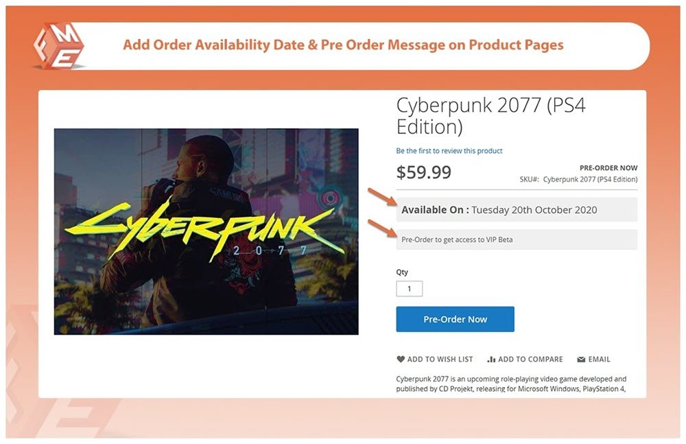
Allow customers to pre-order

Allowing your customers to pre-order for the most demanding and awaited products is an exciting feature you can utilize for advancing the conversion game of your online store. It helps you collect funds quite before making the products available. With tools like Magento 2 pre order extension, you can add the functionality of enabling pre-ordering for your store items. The extension is useful in creating curiosity and demand for specific products on your eCommerce website. The tool supports the online store powered by Magento, whereas merchants using any other platform can search for alternate solutions on their respective marketplaces.
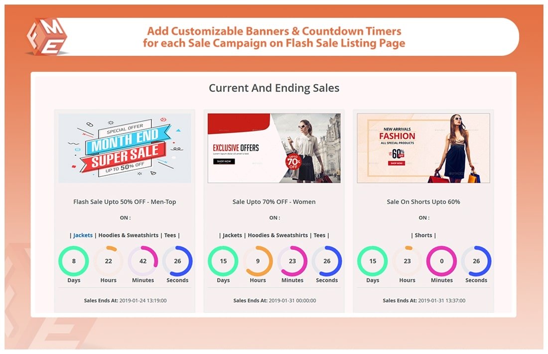
Enable flash sales

Going live with your products or services online takes a continuous struggle. You may have developed a complete online store from a basic idea and market research, but still unable to predict an exact amount or number of sales.
To help you avail orders in the starting days, you can enable flash sales on your e-store. The Magento 2 Flash sales extension performs quite well in creating promotional campaigns on your web shop. You can run multiple campaigns that are triggered for a time-period. It can be for summer, clearing, Christmas, or New Year.
Personalize the Call to action
A call to action (CTA) is a helping hand on your product pages that direct the customers towards an action. It can either be adding products to cart, signing up for accounts, subscribing for email updates, donating to a noble cause, or about any of your end goals.
An e-store is developed for reaching out to target audiences and converting them into customers, followers, or subscribers. If they fail to understand the action they are required to take, there will be no need to displaying the call to action.
Try to personalize the call to action buttons with bright and highlighting colors, and easy to understand the text. Blue is a prominent and like the most by the majority of the users. Make sure the CTA is placed above the fold or at a prominent position of a product page.
Deploy pop-ups on cart abandonment
Bring users to a web shop is half the effort, the rest belongs to on-page design and content elements else, you may face a higher cart abandonment rate. The basic design features include navigation, search box, product inquiry form, live chat, etc. whereas, an advanced strategy is showing a discount offer in a popup when the customer decides the leave with unfinished purchases and clicks the tab close button.
Use the exit pop-up in your website design to your benefit. Include promotions, discounts, deals, and offers in a popup and display it on exit trigger. The popup will only show to the concerned customers with amazing deals he or she can never reject.
Use white space for better readability
The white space between header, title, images, and product description on your web shop serves as a relief to the eyesight of your customers. A continuous flow of content without whitespace stops the users from taking rest and finding a feature, they need the most.
With the help of white spacing, you can provide the information in multiple steps. Therefore, the users can move ahead with grabbing the points they need and skip the irrelevant ones. In addition to white spacing, you can use larger fonts and simple language for improving the readability of your text content.
Replace stock images with HD photography
In a hurry of launching your website, you might decide to go with the stock imagery. Stop going live if you are doing so. Put down the stock images that are available free to all other vendors as you may lose on your unique selling proposition because all others use the same.
Invest in high definition product photography or turn to professional graphics if you want to be different the way your products and services are. It is mandatory before you offer a sale on the store. Once you go live and start serving the customers, you will be able to collect user-generated photography that is twice effective than the stock photos. Therefore, avoid the use of stock imagery.
Conclusion
The pre-order option and flash sales strategy are useful in boosting store revenue significantly. This can help get ready for the pre-launch and earn a stable position in the market as soon as your website goes live. The additional design elevations tips include personalizing the call to action, adding an exit popup, using white space and high-quality photography.
Author Bio
Hamza Riaz is a Digital Marketing Expert at FME Extensions, a leading Magento design and development agency. He tackles the digital marketing of top notch Magento 2 Extensions developed by FME. Also, he likes to share his experience and thoughts in the form of write-ups. You can find him on LinkedIn.
Discover more from Life and Tech Shots Magazine
Subscribe to get the latest posts sent to your email.