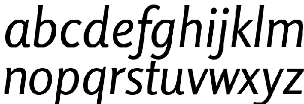
To make your design look cool and splendid a designer depends upon a number of fresh and new fonts. The fonts can really make or mar any design. Sans Serif fonts are generally used for paragraph text along with headings and sub headings. These fonts are simply very easy to read over the screens.
The Sans Serif fonts carry the extra bits linked to each other which are at times termed as feet. The Wikipedia describes these fonts as semi structural details. The below is the list of top free Sans Serif fonts which helps you in making awesome designs.
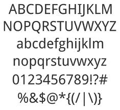
Droid Sans
Steve Matteson (Type director – Ascender Corp.) designed this typeface which is counted under humanist Sans Serif fonts. The Droid Sans was simply designed carrying an upright stress having a friendly and neutral appearance seen in open forms. The Droid Sans font was basically optimized for different user interfaces and is a convenient option for cellphone device menus, screen text and web browser.
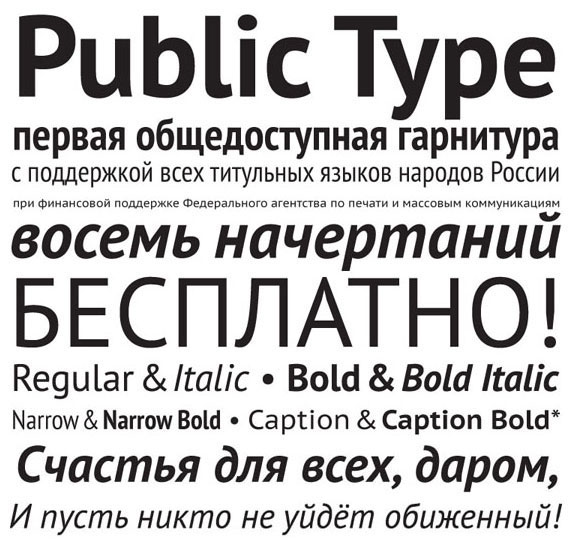
PT Sans
It is also called as ПТ Санс in Russian language which was created by ParatType in the year 2009 and since then embarked with numerous updates. It was basically designed to support a couple of variations of Cyrillic script generally used as minority languages of Russia. This typeface include standard Cyrillic, Western and European code pages, along with the different characters found in each and every title language in Russia. These all features make them a significant and unique tool for modern day digital communications.
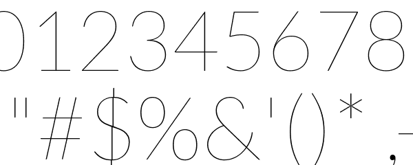
Lato
A designer from Warsaw called Łukasz Dziedzic designed Lato in the year 2010. Lato means ‘summer’ in Polish language. Since the advent of this font, it was seen with numerous changes. Though originally Lato was designed as a corporate font for bigger clients, however, it ended up being used in several stylistic directions. Lato is designed in a transparent manner so that while using it in a body text, it can showcase some of its original traits in larger sizes. In order to give the traits of elegance and harmony to the letterforms, the designer of Lato used classical proportions. A warmth feeling comes with semi rounded details in Lato along with the robust structure to give seriousness and stability in your design.
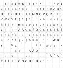
Arimo
This font is designed in Helvetica style having standard four weights of italic, bold regular, and bold italic. Steve Matteson was the man behind designing Arimo. It is considered to be refreshing and innovative Sans Serif design which supports metrically to the Arial font. With Arimo, you can find improved amount of on screen readability features along with the pan European WGL character set. This fulfill the requirements of designers who are keen to have wide compatible typecasts in order to address the document portability all across the interfaces.
Rosario
This is among the newly added font in Sans Serif family which has classic proportions along with delicate and week endings. By using Rosario carefully in the magazines and journals gives an elegant and ideal appearance. Rosario comes with added features last year.
Final word
Using these free Sans Serif fonts in various designs would certainly add lots of value in your projects. These make cool heading fonts; however, you should be smart enough to choose them as per the nature of your design projects.
About The author: Claudia is an internet marketer/blogger. She loves travelling, meeting new peoples and SEO Services. These days she is working on feature that is related to SEO Morpheus that has affected due to recent Google and penguin update.
Subscribe to our RSS-feed and follow us on Twitter to stay in touch.
Discover more from Life and Tech Shots Magazine
Subscribe to get the latest posts sent to your email.
