The modern art guide written by Susie Hodge, “Why Your Five Year Old Could Not Have Done That”, explains in great detail why your child isn’t actually able to create something similar to Jackson Pollock’s abstract paintings or Kazimir Malevich’s Black Square. Let’s follow Hodge’s method and look at logo design – Nike’s logo specifically. Why couldn’t your child design such a simple graphic?

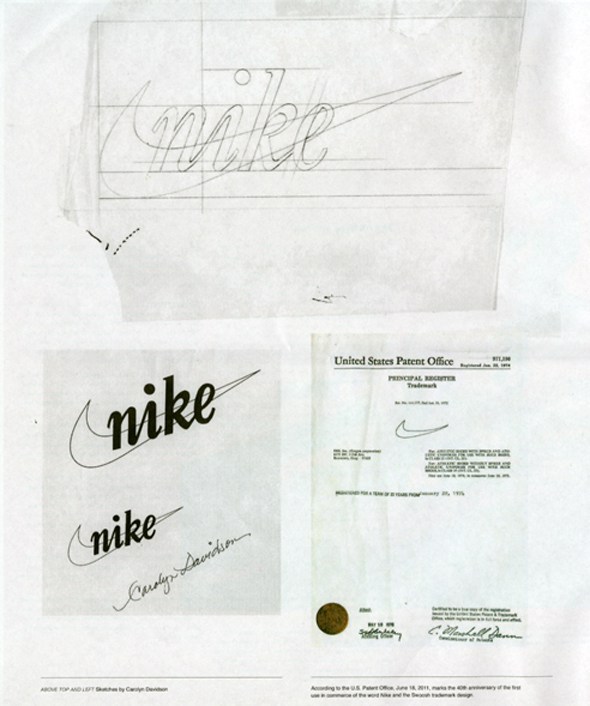
Nike doesn’t require any introductions. The world-famous company is literally everywhere around us. Little known story is about the ‘Swoosh’ logo. It was designed by Carolyn Davidson, and was first used in 1971, three years later it was registered with the U.S. Patent and Trademark Office. Carolyn herself graduated in 1971 with a bachelor in graphic design from the Portland State University.

The Swoosh logo attempts to symbolize movement. Moreover, the wing is said to represent the wing of Nike, the famous Greek Goddess of Victory, also the source of the company’s name. Carolyn was asked to try and incorporate motion into her design but at the same time avoid any similarity to their competitor’s three stripes: Adidas. When ready, Carolyn presented several different designs to the company, the now famous ‘Swoosh’ amongst them.
The work was relatively time-sensitive as the company needed the logo to commence production in Mexico, therefore, Carolyn didn’t get any extra time to improve her project after receiving feedback. Overall, Davidson worked around 17.5 hours on her design.

One would expect that logo design requires appropriate payment. In the case of Carolyn, she was awarded the grand sum of $35 for her work. Luckily someone woke up a decade later and awarded a much higher reward; shares in Nike, a ring with Swoosh on it and a very big party in her honor. From then on, Nike’s stocks allowed her to live comfortably. However, she claims she is not a millionaire.

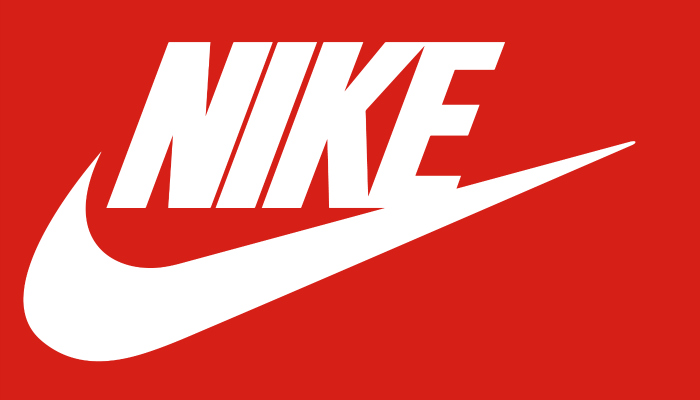
Coming back to the design, at the early stages, the logo featured more than only the well known Swoosh. At first, it incorporated the Nike name together with the graphic. Only with time and years passing by, as minimalism and simplicity gained significant popularity, the company decided to keep the motion symbol single. Same goes for colors. In 1985 the official Nike colors were red and white and only recently the black and white version gained the highest approbation.

The Swoosh is one of very few truly iconic logos: No matter what color, it’s always recognizable as just Nike. Imagine switching the colors of Microsoft’s logo – from four squares in red, blue, yellow and green to pink, grey, white and orange. You would have no idea what it represents.

Funny enough, the logo, nowadays adored by so many, at first didn’t win Nike’s heart. Only after a while, the founder of the company grew to love it. Nowadays, the logo, even without the company’s name, is so recognizable that its success does not need to be extensively described in this article.
So why couldn’t your five-year-old design it? Multiple reasons:

First of all, simplicity as a result does not indicate simplicity in the process. It’s not simple to keep it simple. Steve Jobs once said it well;
‘Simple can be harder than complex: You have to work hard to get your thinking clean to make it simple. But it’s worth it in the end because once you get there, you can move mountains.’
Could your child make a design showing movement in something that is static? Or present 5 different design solutions to the client all according to the given brief? Designing a logo which remains unchanged throughout decades and is recognizable no matter in what color is it presented, or what background it is shown on.
Author Bio
Natalia Raben is International Business student taking care of marketing @ DesignBro (https://designbro.com). Lover of design, photography and the arts.
Discover more from Life and Tech Shots Magazine
Subscribe to get the latest posts sent to your email.