In this article, we are going to discuss the structure and navigation of websites.
This article is intended to readers who are new to web design and is trying to learn the basic website structure.
Let’s begin with website Structure.
Structure of a Website
Let me consider that you are new to the idea of website structure, and start from the beginning.
Here we will discuss the following things,
What is a website structure?
Why do your website need a structure?
How a website structure is implemented?
If you are already familiar with the concept, bear with me so that the newbie’s could catch up.
Basic Structures in Web Design
When it comes to structure in web design, there are 3 major categories,
Linear/Sequence Structure
This structure is not commonly used and it’s generally used when website is very small in size, like 4 – 5 pages.
For example,
If you are creating a website exclusively for a particular event that is being held on a particular date, then the linear structure will be ideal.
This would entail 3-4 pages and you would take your users through a funnel intended from page 1 to 4
In this case, you will take users first to a landing page, page 1, which would talk about the even in general. Then you would take the users to a 2nd page which include detailed content about the event, like who is attending the event or who are the speakers of the event. Then you may take them to a 3rd page which talks about the prices and how to purchase the tickets for this event, this page might probably contain a form.
This linear structure of websites is generally not very common, and this linear structure is intended for only small websites.
Let’s move on to the 2nd type of web design structure.
Hierarchical Structure
The hierarchical structure is the most important among web design structures.
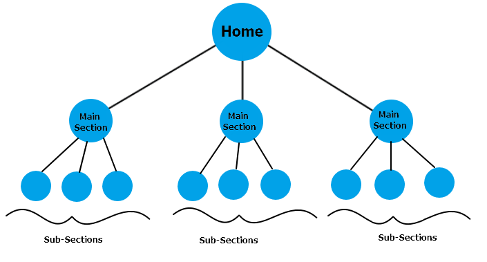
It follows the structure of a tree, where you will have a main branch which leads into sub-branches.
We will talk in detail about the hierarchical structure later in this article.
Matrix/Web Structure
This structure is not common for websites. This is not a structure to implement in your website as it is a concept mainly for search engines to identify how your website is connected to other websites. So, Matrix/Web structure is not an internal website structure, but an external website linking structure. It is the random linking structure of your website with other websites.
In this article, we are going to discuss more about the hierarchical structure as, it is the only important structure that matters to web designers.
Hierarchical Web Design Structure
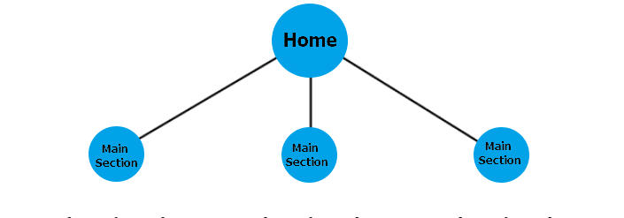
In general, every websites starts with a landing page which will often be your Homepage.
From Homepage, you go to the main sections of your website. These main sections of your websites are often called sitelinks.

When you Google any major website, you could see that there are links to other main sections of that website in their search result. This is what sitelinks are about.
For Example, the main sections of your website might be News, Events or Blogs. From these sections users will be able to explore contents belonging to a particular type.
From the main sections of your website, you can dig a level deeper to show the sub-sections. This will be where the individual pages of your website live, or this could indeed be a sub-section of your main section.
For Example, sports, politics, sub-section of News section or a sub-section for different regions or topics for your event section.

Typically, it is advised to include individual pages in your sub-section as any pages far from 4 or more clicks away from the homepage is not a good user friendly sign. More the hierarchy you have in your website, more complex the navigation becomes.
So try to include all you pages in at least 3 clicks away from your homepage. This will also give you an added benefit if you are doing search engine optimization (SEO) for your website.
This is how a hierarchical structure is basically laid out.
Now let’s see why we need a web design structure to begin with.
Why do you need a web design structure?
The first and foremost reason for having a well laid out website structure is that it makes your user interface (UI) much better and deliver the best user experience (UX). A good UI/UX is extremely important in the success of your website.
A good web design structure will make it super easy for your audience to find what they are looking for in your website. This in turn will increase the user engagement and the performance of your website.
A well-structured website can even increase your revenue if your business is very much depended on the online audience.
Another important advantage of having a great website structure is that it will be as easy for search engines to crawl and index your website as easy it is for users to navigate through your website.
Good website structure will indeed boost your SEO and chances to rank better in Google search results.
Finally, it will be way easier for the people who manages your website to navigate to the pages they want and guess the location and url of a web page or to implement a site-wide url modification etc.
So, let’s sum up some of the great benefits of having a good website structure.
Better user experience
Proper Site-links / Sitemap
Faster Search Engine crawling
Optimized Results in SEO
Easier to manage web pages
Now, let’s look at how should we implement a website structure.
How to plan and implement a website structure?
Now that we know what a website structure is, let’s see how we should implement it in a website.
To implement a web design structure, first you need to come up with a plan. This plan should be implemented right from the early stage of design process.
You should consider the following things while you are planning a website structure.
Use at least 2 to 8 main sections. Anything less than 2 main sections is too low for a website and websites with more than 8 main sections is too complicated.
Think from your user’s perspective and think about the tasks you want them to accomplish in your website and the content that might attract them.
Keep the number of subsections balanced, so that you are having more or less same number of sub-sections for every main section.
Make sure your pages are not buried too deep in your website. If you have too many levels in your website, the user will get confused and they won’t be able to navigate easily in your website.
Make sure you list your main sections in Header and Footer of your website. The main content sections of your website must be available to the users at any page and any time.
Following the above principles, you will be able to design the website with a very intuitive navigation structure, where audience will know exactly where to look for to find what they need.
Navigation elements in a website
In order to create a good website structure, you need to know understand the concept of website navigation design. Web navigation is how, or what are the different elements in your web page that makes it easier for users to communicate and go from one page to another. These elements are basically internal links present all over your website.
Let’s understand some of the basic navigation elements in a website.
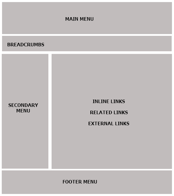
Below image shows some of the main navigational elements used in website.

You may be familiar with some or all of these navigational options from websites you had visited. However, each of these navigational areas are used to meet unique navigational needs of website visitors. Let’s understand the purpose of these navigational elements.
Main Menu
Main menu is the most important navigation element and its mainly located in your website header.
Secondary Menu
As the name implies this menu is secondary, which means it is for a subsection or a main section. It is generally located in the left navigation, often called as sidebar.
Bread Crumbs
Breadcrumbs are very important and yet, often ignored navigational element. Breadcrumbs explain to the user where they are located in the website right now, when they land on a particular webpage of your website from search engines like Google or other external websites. Breadcrumbs are extremely important web navigational element for any website as they explain to the users about the section of website they have landed.
Inline links , Related links & External Links
These are different links that you can have within the content area of your website. These links encourage more interaction from the users and makes the browsing experience of your website audience even better.
Footer Menu
Footer links are located in the footer of your website. They are another important navigational element, sometimes you give the most important links in your Main Menu in the Footer as well. This is to help users find the link to main pages of your website even when they scroll down to the bottom of your page.
Footer menu is also features some seldom used links like your, privacy policy, terms and conditions, sitemap etc; these are not the first pages you want your website audience to visit. Hence you use footer navigation to provide these links.
Author Bio: Pranoy Sundar is Digital Marketer in Global Media Insight a web design company based in Dubai. He is passionate about everything to do with digital marketing – from designing websites, creating content to online advertisements and SEO.
Subscribe to our RSS-feed and follow us on Twitter to stay in touch.