Great UI/UX design helps to differentiate your website from competitors. A well-designed SaaS website helps the visitors to understand the core values and unique selling propositions of the software and therefore convert them into customers.
But what does a good SaaS web design mean and how should it look like?
To give a comprehensive answer to this question I’ll provide you with examples of the best SaaS websites and analyze what features make them stand out.
Examples of effective SaaS websites
To show how effective SaaS websites look like we won’t have to dig through the whole internet. We will analyze the websites of five popular SaaS companies whose products are known all over the world and probably you are familiar with most of them as well.
Slack
Many people know Slack as a messenger for collaboration and making important decisions within the organization. Today it does not require a special presentation, as it is known worldwide. So, let’s figure out what Slack did great in their design.
First of all, the site clearly displays what the company does and what value it can provide to users. The bold headline “Welcome to your new HQ” draws people’s attention and motivates them for further investigation of the website.
Contrasting CTA with the direct copy “Try it for free” is impossible not to notice (pay attention to the size, color, and background). In general, the use of color throughout the site helps to highlight the important information and give the user the feel of the application.
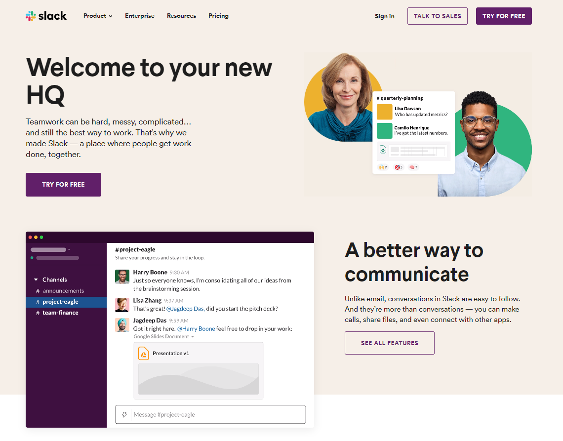
The website has clear and easy-to-use navigation and many interactive visuals. For example, on the home-page, the user may find an animation that shows exactly how the app looks like and what features it has, what is more, the user can interact with it.
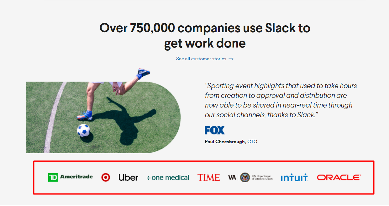
To increase credibility Slack shows the visitor logos of popular companies that use this cloud application.
To sum up, Slack’s website has a clear value proposition, noticeable CTAs, interactive visuals, and clear navigation.
Dropbox
Dropbox is a leader in cloud storage services that allow users to share data and cooperate effectively with each other.
Dropbox’s design is known for being clean and straightforward. The website uses a lot of white space that makes it light and not cluttered, so the customer can quickly find the needed information.
As well, pay attention to the navigation at the top of the website. It is extremely intuitive and helps the user to receive answers to the most important questions: What kind of application is this? What can I do with Dropbox? How much will it cost?
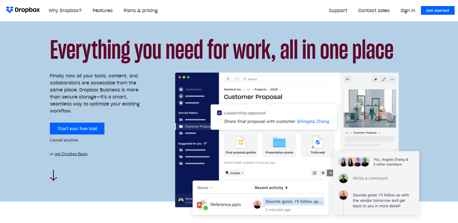
The headline on the website is straight-to-the-point and logically moves the viewer’s eyes from it to the subheading and then to the call-to-action button.
As well, it’s worth mentioning that Dropbox puts their pricing on the home-page right after the header. That’s because this company is very popular and most users that visit the site know what Dropbox is and the whole design of the site is focused on the signing-up process.
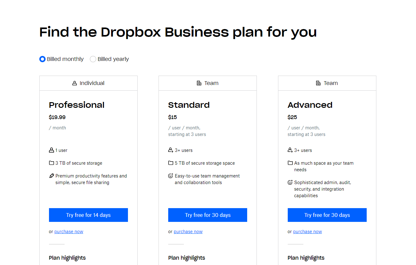
However, if your SaaS is a start-up it’s better to focus more on explaining to your customers the reasons why they need your product.
Dropbox’s design is simple, easy to use, and doesn’t contain any unnecessary elements.
Mailchimp
Mailchimp is a cloud marketing software that helps you manage communication with clients.
Its web design charms with simplicity, and clear and concise texts.
Big headlines with straight-forward copy are benefit-centric. Bright-blue CTA on the yellow background immediately attracts the viewer’s attention to it.
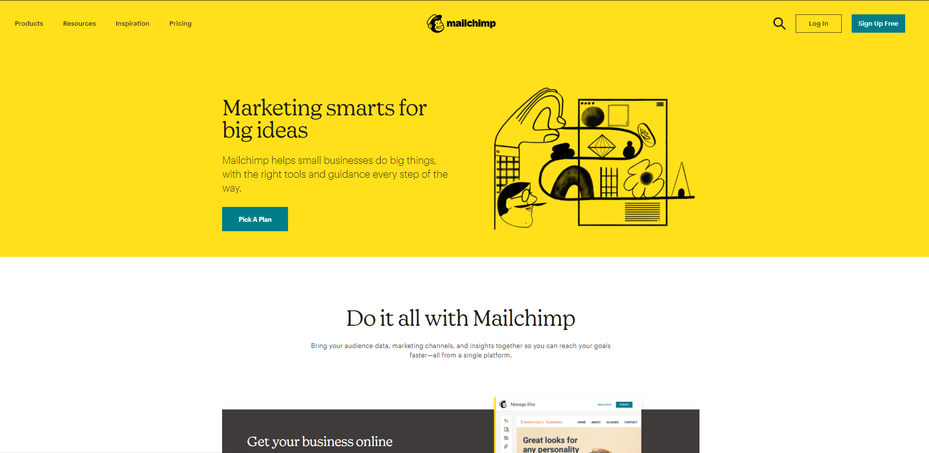
Simple navigation at the top of the page instructs the user what steps to take if they don’t want to sign-up straight away, but need some more info.
As well, the website is not overloaded with visuals or unnecessary graphics, that’s why all the information is easy to perceive.
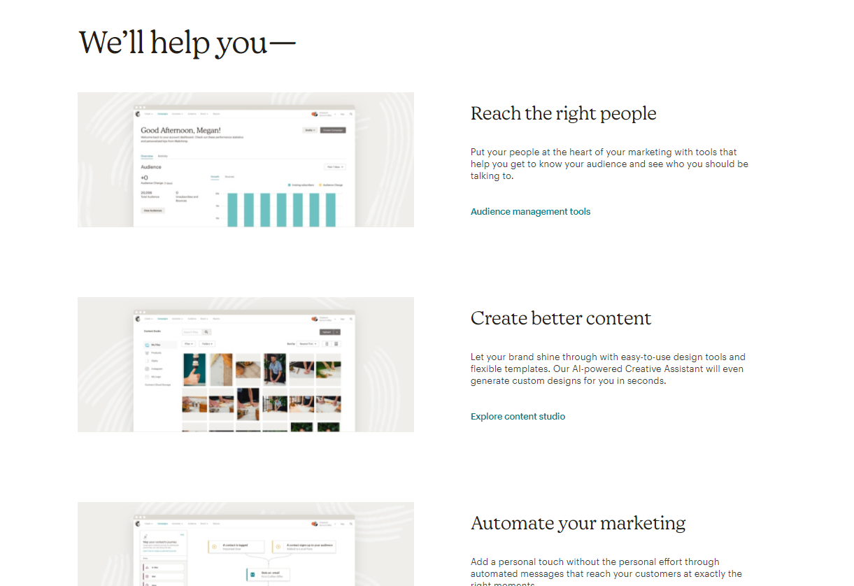
The web design of Mailchimp is clean, minimalistic and therefore it quickly and efficiently communicates the product’s value to the customers.
Github
GitHub is a project management and code hosting cloud software for developers.
The design of Github’s website is user-friendly and interactive. A lot of fun visuals and animations show that GitHub knows its customer well. At the same time, there are a lot of real screenshots that serve as proof of the written benefits of this SaaS.
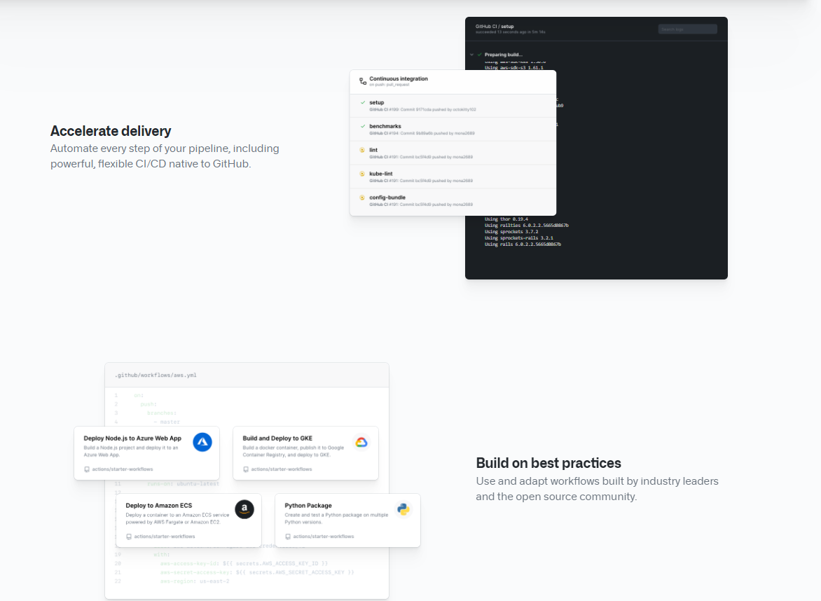
The call-to-action buttons are easy-to-notice and all the headlines clearly communicate the value proposition.
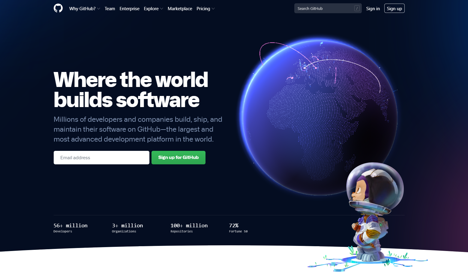
In the screenshot above pay attention to where the astronaut directs his gaze. Yes, he looks at the CTA, and this way he makes the visitor look at that contrasting green button as well.
PandaDoc
Pandadoc is a SaaS document management platform.
The first thing to mention about PandaDoc’s website is a clear website structure and clear value proposition. The headline on the main page catches the eye and provides the visitor with the benefit they will get from this app.
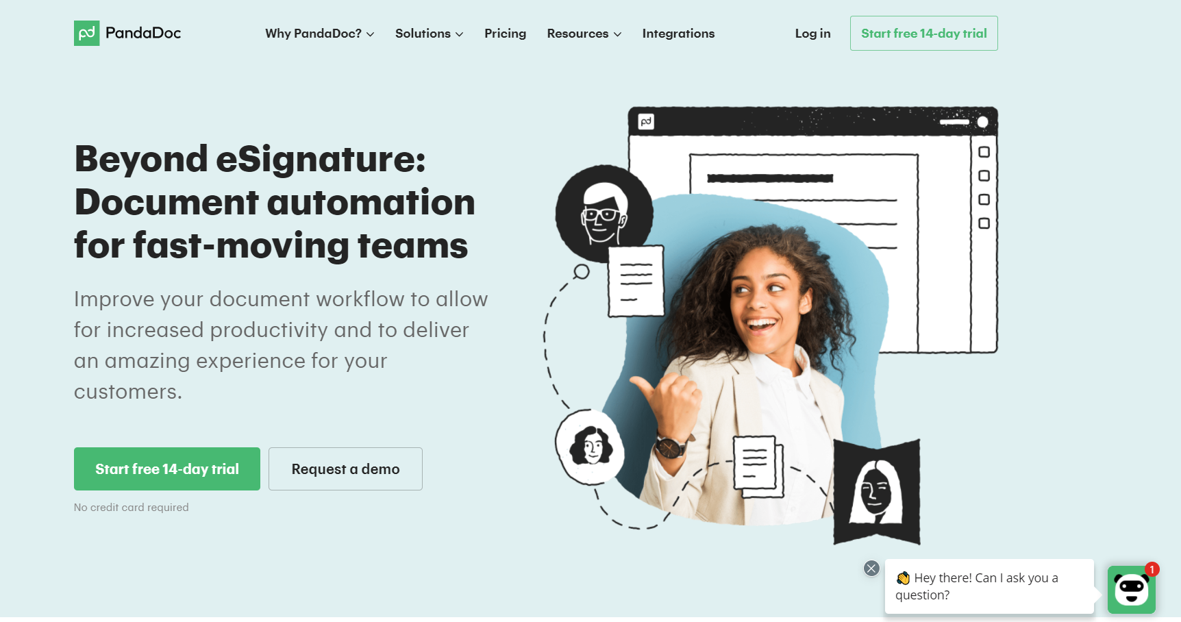
In general, PandaDoc has an interesting UI design: its visuals are combinations of photos and illustrations and the color scheme is pale, but still matches the rest design elements.
Principles of good SaaS website design
Based on the above examples we can single out the following tips on what a good SaaS design should be like:
- It should as soon as possible give your customers answers to the following questions: “Who are you?”, “What are you doing?”, “What value can your customer get here?” The use of white space, different size fonts, and contrast will help you to highlight the needed information.
- It should call for action. The design should prompt the user to take action and explore the website further. Therefore, make your CTA big enough to notice and create a short but straightforward copy.
- It should be optimized. Each page of your cloud website should be intuitive and easy to use, and key navigation elements always visible.
- It should be customer-centric. Imagine yourself in your customer’s shoes and try to understand what answers they want to find on your website.
Some parting words
Effective SaaS website doesn’t have a strict formula of success. As you may have noticed, each website example we provided in this article has some common elements, regardless of its specifics. At the same time, each of them is different from the other.
Create, don’t copy. Think of your target audience with their pains and needs, tell them about your product, highlighting its unique features. Following this simple rule will help you to create a site that people will like and someday it will become a part of the above list.
Subscribe to our RSS-feed and follow us on Twitter to stay in touch.
Discover more from Life and Tech Shots Magazine
Subscribe to get the latest posts sent to your email.